OptaSense® User Manual
A full guide to all User functions of the OptaSense system
Terminology and Acronyms
This document will refer to words and acronyms that are often unique to OptaSense. The lists below give a brief explanation of each.
Acronyms
| Acronym | Meaning |
|---|---|
| CU | Control Unit |
| PU | Processing Unit |
| DPU | Dual Processing Unit |
| GUI | Graphical User Interface |
| OPS | Optical Processing System |
| IU | Interrogator Unit |
| DAS | Distributed Acoustic Sensing |
| KP | Kilometre Point |
| OS | Operating System |
| TOTP | Time-based One-Time Password |
Terminology
| Term | Meaning |
|---|---|
| Control Unit | A Windows-based PC built specifically to run the OptaSense software and monitor an asset. |
| Processing Unit | A server specifically to process/store the data from the Interrogator Unit |
| Interrogator Unit | An OptaSense proprietary product that connects to the fibre and performs Distributed Acoustic Sensing (DAS) measurements |
| Cursor | The position indicator on the computer screen that is moved by use of the mouse |
| Desktop | This is the large display area that appears when the CU is activated. On it there are different icons that provide to access different functions |
| Graphical User Interface | The OptaSense software presented to the user on the CU |
| Icon | This is a picture that represents a function that can be carried out on the computer. Click on an icon to activate its function |
| Layer | Layers are used in the map window to show and hide different types of visual information |
| Optical Processing System | A multi-component system comprising an Interrogator Unit and Processing Unit. |
| Tab | This is an access link to different pages within a window covering different areas of interest as represented by the tab heading |
| Toolbar | This is a menu bar where the menu items are presented as icons |
| Task Bar | This is the bar that runs along the base of the window which shows which applications are running |
| Status Bar | This is a bar at the bottom of a Window that displays status information to the user. It often pertains to the mouse position |
| Pane | This is a region of a window defined by a border, used to display data |
| Window | An area on the screen that displays information for a specific program. A typical window includes a title bar along the top that describes the contents of the window, followed by a menu bar and toolbar. Most of the window's remaining area is a pane(s) used to display the content. |
| Histogram | A chart displayed in real time on the Surveillance Waterfall Window. It represents the amplitude of the sound observed by each channel. |
| Waterfall | A dynamic chart that represents live & historical data from the histogram. Location is represented along the x-axis; time is shown on the y-axis and amplitude of the signal is represented by varying colours. |
Introduction
The purpose of this document is to provide a user the information required to monitor an asset using OptaSense Version 6 software. It provides detailed descriptions on system functionality and explains all features and tools available to the user. OptaSense Version 6 provides three user access levels to cater for a variety of roles and are described as follows:
| User Level | Description |
|---|---|
| Light User | Light User provides read only access to the system. This level of access prevents any changes to the configuration and has no functionality that allows the user to do anything but view the system |
| User | User access for monitoring the system. Cannot make changes to the configuration of the software and has restricted functionality. |
| Trained User | The Trained User is designed as an Administration level user. There are some functions that this user will have access to that will not be accessible to User. A TOTP code is required to access some advanced configuration areas |
This manual primarily provides guidance for those with User-level access. However, it is also applicable to Light Users, but in a view-only capacity.
An additional set of modular manuals are available for Trained Users at the administration-level. For further details on manuals or a particular installation, please contact a Trained User or OptaSense representative.
What is OptaSense®?
OptaSense® is a sophisticated fibre optic-based system that allows Users to monitor acoustic activity at any point along a deployment of fibre optic cable. This acoustic surveillance capability is partnered with sophisticated acoustic analysis software which provides event alerts to the end user. These alerts provide a powerful, automated means of monitoring linear assets such as perimeters, borders and pipelines, alerting the user to the presence of unauthorised activity taking place.
The OptaSense® system hardware and software typically comprise the following component parts:
- Fibre Optic Cable – A cable containing one or more optical fibres which is typically deployed alongside the asset being monitored.
- Interrogator Unit (IU) – This piece of hardware sends pulses of light along the sensing fibre and performs data processing to determine event position and classification. Multiple IUs can be deployed along a fibre and each IU, when combined with local Processing Units (PU), will be known as an Optical Processing System (OPS).
- Processing Unit (PU) – This piece of Hardware receives/processes data from an IU (or if a DPU, two IUs)
- Control Unit (CU) – A PC built specifically to run the OptaSense software. This is where the user will monitor the system. The CU comprises a PC, two screens, a mouse, a keyboard, a set of speakers and headphones.
A typical OptaSense installation utilises existing fibre optic cable often buried at depths up to 2 metres near the asset being monitored. However, if OptaSense is deployed on a perimeter fence or aboveground pipeline the cable can be mounted directly on the asset, and/or buried depending on detection requirements.
The acoustic data from the fibre is split into an array of Optical Channels, normally 10m in length, which enable detection of multiple, separate events along the length of the fibre optic cable. The detection capability of the system is intrinsically linked to the amount of energy imparted into the ground by a particular event, for example a mechanical digging event can be detected at greater distances from the fibre than a person walking. A typical system setup is detailed in (Figure 1).
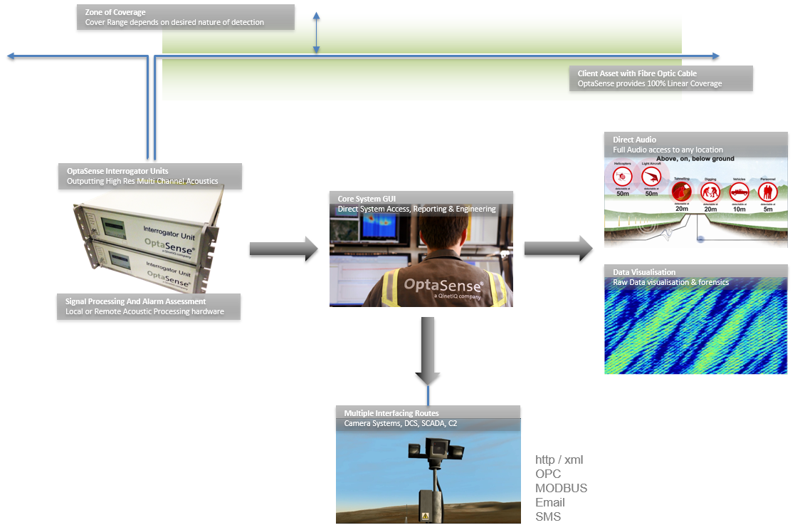
Figure 1: The Deployment Overview for a pipeline system.
Getting Started
This section describes how to start the OptaSense software and provides an overview of the main functions used in monitoring a linear asset.
Starting the Software
Powering up the CU
Turn on the CU. If OptaSense supplied the CU, it will normally be an all-in-one PC or a rack-mounted PC. In the case of the all-in-one variant, the power switch is shown below in Figure 2:
 |
|---|
Figure 2: Power switch location on OptaSense all-in-one Control Unit indicated by the arrow.
Logging in
Once the CU is powered up, select the User account from the list of two Windows users. This will bring up the password field as shown in Figure 3. Type the password, then press “Enter” or click on the arrow to log in.
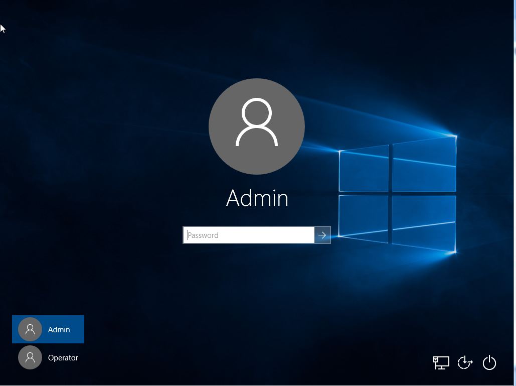
Figure 3: Windows logon screen showing Administrator password field.
Note that there are two levels of Windows user login attributed to the OptaSense system and these are described as follows:
| Username | Description |
|---|---|
| User | The standard windows login allowing the User to have full functional control of OS6 but with no Windows administrative rights. |
| Admin | This role is reserved for OptaSense Engineers and qualified installers. |
After logging into the User account, the software will be automatically launched. If the software does not automatically launch, it can be started by clicking on “Operator Interface” from the start menu. This will be contained within an “OptaSense6.X.X” folder, as shown in Figure 4.
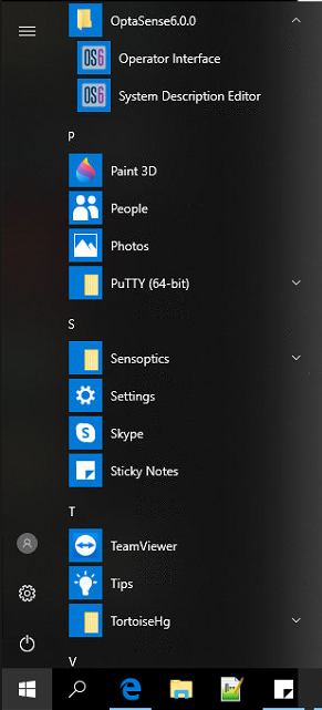
Figure 4: Starting OptaSense from the Windows Start menu.
A splash screen (Figure 5) will appear when the software is starting up.
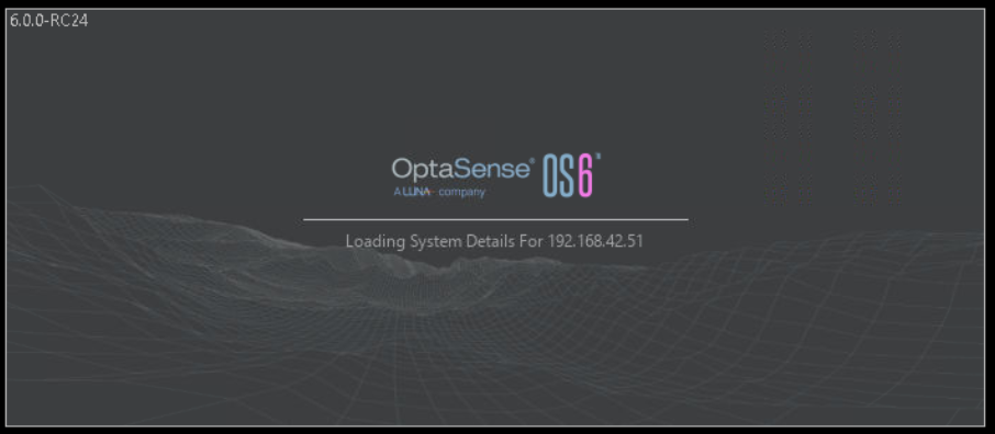
Figure 5: Splash Screen displayed on start-up.
Once the software has loaded, it will prompt the user to login using their unique OptaSense username and password, as shown in Figure 6. This will be provided by a system administrator or by OptaSense.
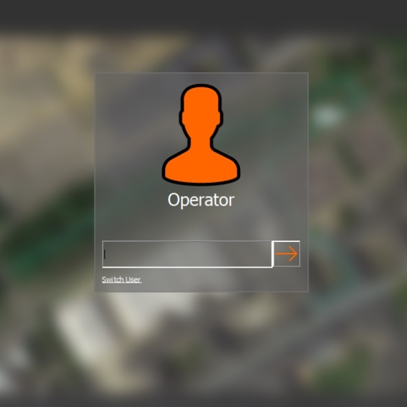
Figure 6: OptaSense software login screen.
Exiting the OptaSense Software and Logging Off
To exit the software, click the “X” at the top-right corner of the GUI window then click “Yes” when prompted. It is also possible to exit the GUI using the System option on the Main window. Exiting the GUI does not affect the operation of the system as the detection and classification of events is driven by the OptaSense software running on the PUs. The GUI is simply a visualisation and control tool of which there can be several running across the system. These various quitting methods are shown in Figure 7.
![]()
(a) Quitting software using “X” at top-right corner
 (b) Quitting software from within system menu (b) Quitting software from within system menu 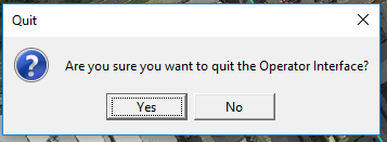 (c) Quit confirmation dialogue (c) Quit confirmation dialogue |
|---|
Figure 7: Quitting the OptaSense software.
Once the OptaSense GUI has been shut, it is then possible to log off from the Windows User account by clicking “Start”, then “User” and then “Sign out”, as shown in Figure 8.
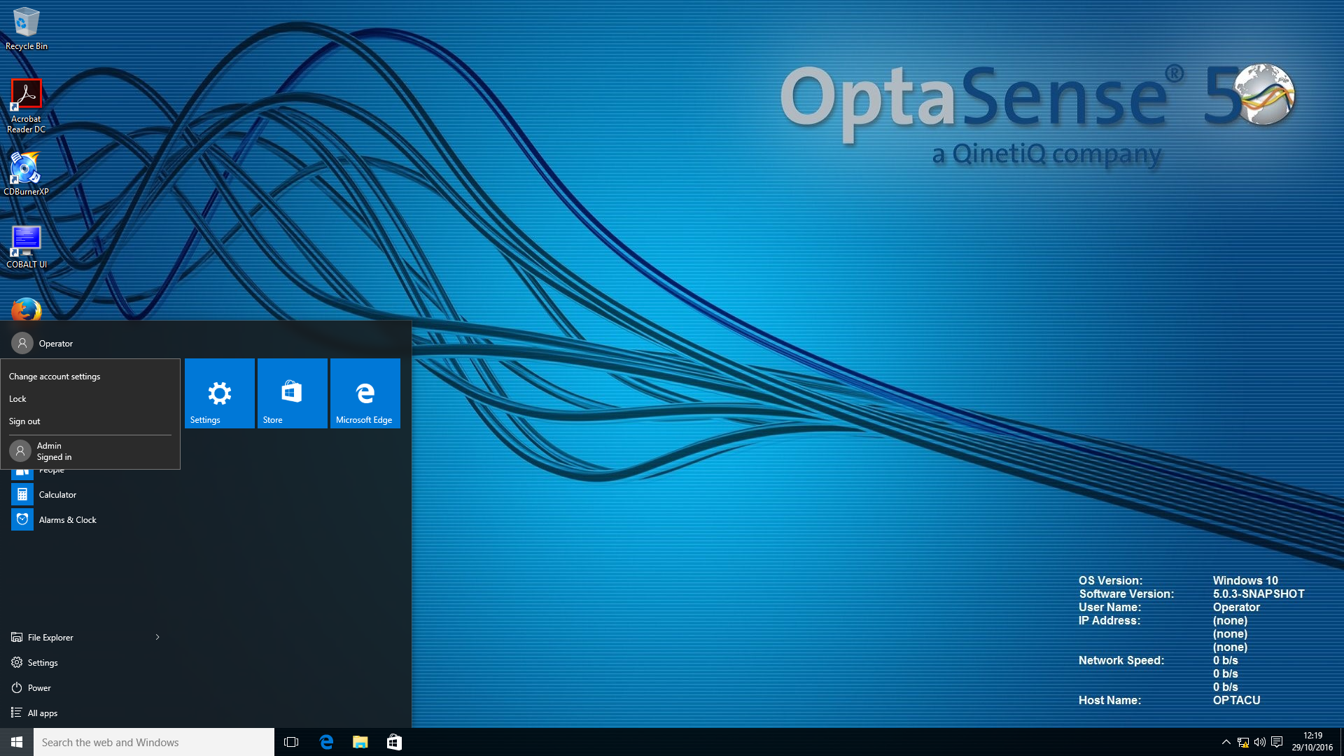
Figure 8: Logging off the User account.
Navigating the GUI
This section explains in detail how to navigate around the GUI and describes the function of each element of the OptaSense graphical user interface.
GUI Overview
The typical User GUI display arrangement will include two main features:
- The OptaSense Map Window
- The Surveillance Waterfall
The layout of these features is fully customisable and extra tools may be available dependent upon client requirements. An example of the standard dual-screen display is shown in Figure 9 below.
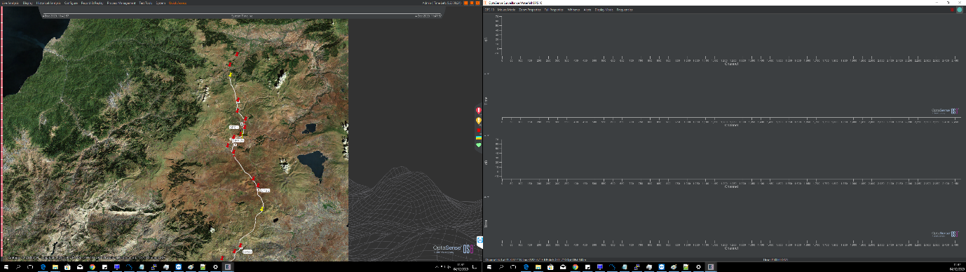
Figure 9: Main overview of the GUI.
The OptaSense Map Window
The OptaSense Map window is the primary interface for displaying alerts in real time on a geographic display of the asset. A large amount of information is available in this window, including the fibre route, map images, zones, alerts, path layers and markers.
The map window (shown below) consists of several key parts: The Map itself, Menu options to access the appropriate functions of the system, the System Health bar, the Side Status bar, the System Timeline, and the Toolkit. Each of these provides access to functions that are used to monitor alerts, navigate the map and to associate alerts with their locations on the map.
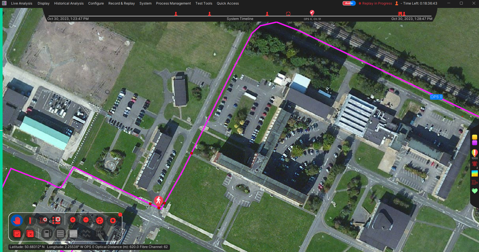
Figure 10: OptaSense Map Display.
The Menu
The Menu bar provides access to all the functions that a User requires, this is fully customisable to suit the end user needs and should be discussed with the OptaSense engineer at installation. The functions described below are the default features:
![]()
Figure 11: The Menu Bar
| Live Analysis |  |
|---|---|
| This provides access to: | Alert list window (described in section 7) Pre-Alert list window (described in section 7) Waterfall (described in Section 6) Analysis Frequency Analysis |
| Display | |
| This provides access to: | New Map Display – Opens an additional map display. Markers – Allows the User to toggle them on and off and show the names, as well as allowing markers to overlap. Imagery – allows the imagery to be toggled on and off. XY Grid – Toggles the XY Grid on and off. Paths – Turns the Path Layer on and off. Alerts Layers (Map Only) – controls whether Alerts are displayed on the map. This does not stop alerts appearing in the Side status bar and on the System timeline. Fibre Break Scenarios - controls whether Fibre Break scenarios are displayed on the map. This does not prevent alerts or errors displaying in the Side Status bar and System timeline. Custom Routes – Turns the custom scale layer on and off. Area Of Interest – Turns on and off the real time areas of interest on the map. This does not stop them functioning. |
| Historical Analysis |  |
| This provides access to: | Alert History Waterfall – Described in section 9. Multi-Channel Analysis – Described in section 9. Historical Alerts – Described in section 9. Historical Timeline – Described in section 9. Historical Process Metrics – Described in section 7. |
| System |  |
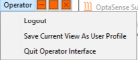
| Look and Feel – This allows the user to change the colour scheme of the GUI. Config management – Allows the User to import & Export config. Alerts – Allows the User to Acknowledge and Dismiss Alerts. Save User Profile – Allows user to save current display/profile. Logout – Log out the software for the next user. About – About the system. Quit the User Interface – Log out the software and close the GUI. Report Issue – Allows the User to raise a support ticket directly to OptaSense where this functionality has been purchased. | |
| Quick Access This menu self populates with frequently used windows/options and allows the user to pin them to this menu |  |
The Map
The map is the core component of the main display and is typically in the form of satellite imagery of the asset being monitored. It could alternatively be a schematic or any other image file depending on customer requirements. For the purposes of this manual, the map layer is satellite imagery and is geo-located using the data provided by the map provider (i.e., the cursor position on the map relates to the latitude/longitude coordinates of that position). Information on the position of the cursor on the map is displayed along the bottom of the window, shown within Figure 12. This tool also includes the cursor coordinates, OPS number, Optical Distance and details pertaining to the asset in a layer known as the “Custom Scale”. In the pipeline industry this might be a Kilometre Point (KP) and Pipeline Name.
![]()
Figure 12: The cursor information at the bottom of the map window.
Map Right Click
Right clicking on the map will open a window with several navigation options and are shown in 15. These options will vary depending upon user type and where the user clicks on the map. For example, clicking on the map alone will give the user a different set of options to when they click on alert or a marker.
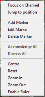 |  | |
|---|---|---|
| (a) Right click on map alone | (b) Right click on marker icon | (c) Right click on alert icon |
Figure 15: Right Click Functions of the Map Window.
Focus on Alert
 This will move the highlight marker on the waterfall and focus on the alert nearest to the cursor on the map window (Figure 16). If this function is selected from the alert list (detailed in Section 5.7) it will focus on the selected alert.
Focus on Position
This will do the same as “Focus on Alert” but will bring up the waterfall and centre it on an area around the position selected.
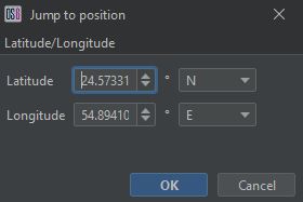
Jump to Position
Click on this to move the map to a desired latitude/longitude or KP. After clicking, a pop-up window will appear, as shown in Figure 17. This allows the user to enter a Latitude and Longitude or KP. The map display will then jump to that specific location.
Configure Markers
OS6 has several pre-defined Marker types that can be made available on a system. To add these to the system, select the ‘Configure Marker’ Tab on the Map.
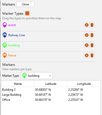
To configure a Marker Type, press the ‘+’ button. The Operator is presented with a set of pre-defined icons. The Operator can select one of these and assign a Marker Type Name and colour.
This Marker Type can then be used to create a Marker on the Map.
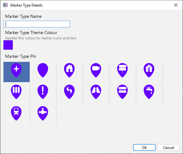
Figure 19: Creation of a Marker Type
Add/Edit/Delete Marker
To create a marker, right click on the map where the marker is required, then click “Add Marker”. A pop-up window will appear asking for a name and marker type (Figure 17). Note for “type”, there will only be one selectable option. For information on how to add another type, refer to Module 6 - Configuration Wizard User Manual, Section 3. To place a marker at a specific location, change the coordinates after clicking “Add Marker”, then click “OK”.
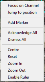

Figure 20: Creating a Marker
Markers can be edited by right clicking on them and selecting “Edit Marker”. The user will then be provided with an option to edit information on the selected marker. Once the desired modifications are made, click “OK” to save changes.
To remove a marker, right click on the marker, and then click “Delete Marker”.
To refine how markers, appear on the map, select “Display” in the top left of the map window. Select the marker layer. The following options will appear in the top right of the map window (Figure 21).
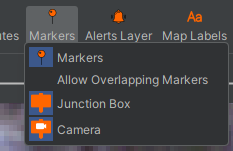
Figure 21: Mark Layer Configuration
Markers – Turns all markers on or off.
Allow Overlapping Markers - Having this option unchecked refines how the markers are visually represented and can reduce clutter of the map window when several markers are close together. For example, if this option was checked and there were multiple markers in one area of the map window, upon zooming out the markers would appear merged and visually untidy.
Type X – Allows individual markers to be hidden or displayed.
Areas Of Interest
This feature may be useful if there is a region of activity which is causing many alerts and the cause of these alerts is known, for example, pipeline maintenance. The Area of Interest is configured by Administrator level users and above, however they are visible to the User and the User can view the alert lists for these areas. They can be viewed by right clicking on the area and selecting Alert Window for ‘Area Of Interest’ (see Figure 20)
![]()
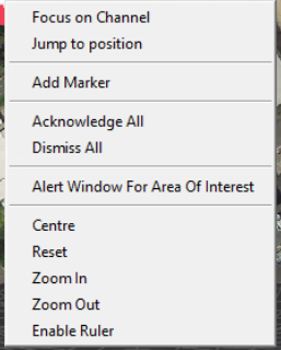
Figure 22: Select size and duration of temporary suppression zone.
Once this is selected the Alert list for the area is displayed (see Figure 21) and the user can acknowledge and dismiss alerts for that area as well as carry out the functions as described in Section 9.
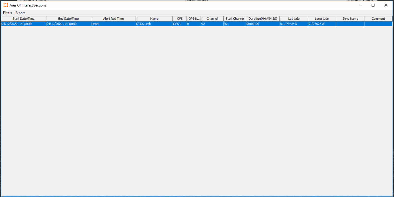
Figure 23: ‘Area of Interest’ Alert Table.
The window also allows the User to Filter the alerts and Export the Alerts as described in Section 9
Map Layers
Map layers provides different functionality and information on the asset. To show or hide layers, click on the Display menu button to open the Display menu where the different layers can be controlled from (Figure 24).
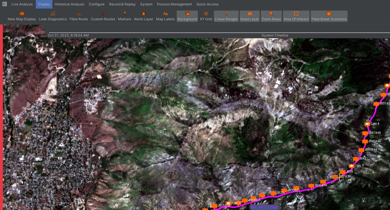
Figure 24: OptaSense Map Window showing all Layers available.
Each of the layers has configurable options and some layers can be disabled.
| Map Features | |
|---|---|
 | Fibre and Custom Routes The fibre route and any custom routes are represented by coloured lines on the map display. |
| Markers Points of interest can be marked on the map using markers. Different marker types can be enabled/disabled independently as well as the entire marker layer. An option for whether to allow overlapping markers is also available. | |
 | Alerts Current alerts are shown as an icon displaying the type of alert. The alert icon size can be configured between two sizes. After the activity is finished and 5 minutes has passed, alerts will fade to a red dot on the map until the alert is dismissed from the alert table |
 | Channel Highlight This marker is an important transition between the OptaSense Map Window and the Waterfall (Covered in Section 6). Once a channel has been “focused on” the yellow cross will show where it is on the map. A line on the histogram will correspond to this location. |
Real Time alerts will appear on the map as they happen.
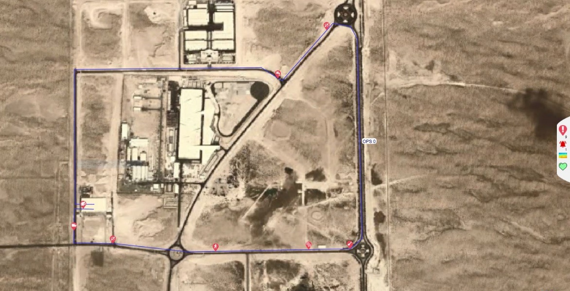
Figure 25: Real Time Alerts View.
Geographical Alert / Waterfall History Search
Alert History Search
To perform a search for alerts in a specified area on the map window, select “Open Bounded Historical Alerts” from the map Toolkit.
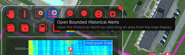
Figure 26: Alert / Waterfall History Search.
Once selected on the Toolkit, draw a box around the area on the map for analysis. When the mouse is released, the Historical Alerts Search window will be displayed with the channel range already defined based on the box drawn earlier. Select the conditions of the report, i.e., Threat Type; Threat Levels and select search to compile the report. The report can then be exported as CSV or HTML to a specified location.
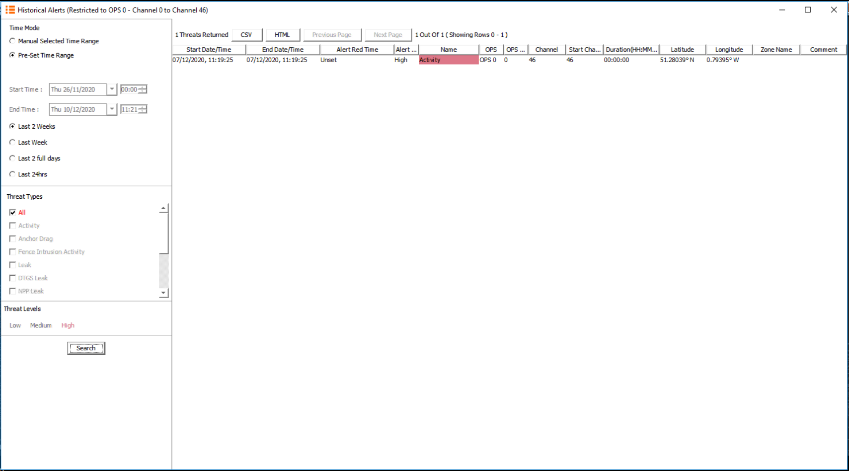
Figure 27: Alert History Search.
Historic Waterfall Search
To obtain the Historic Waterfall a specified area on the map window, select the ‘Bounded Historical Waterfall’ option from the map Toolkit. Once selected, draw a box around the area on the map that requires analysis. When the mouse is released, the Waterfall Search window will open with the search conditions filled out based on the box that was drawn earlier (Note that the conditions of the search can be altered).
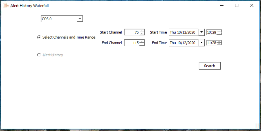
Figure 28: Historic Waterfall Search Conditions.
Once the Historic Waterfall is displayed, there are several options that can be selected:
- An image of the waterfall can be saved by clicking the save icon.
- Sensor data can be extracted.
- Audio of a selected area can be replayed.
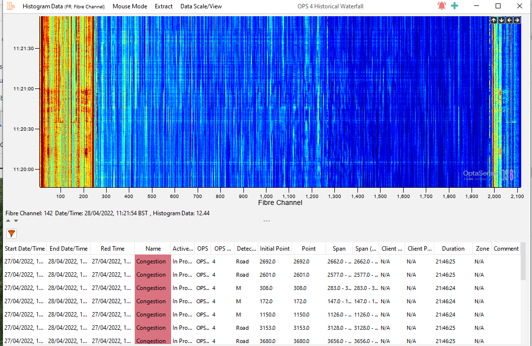
Figure 29: Historic Waterfall.
| Histogram Source |  | Allows the User to select the data source for the waterfall. In standard operation the Histogram Rolling recorder is the default source |
|---|---|---|
| Mouse Mode |  | Channel Zoom – Allows the user to zoom the waterfall as you would on the live waterfall Audio – Allows the User to select an event of interest and replay the Audio for a selected event Historical Analysis Channel – Opens a Analysis Window for the selected channel Measure Speed – allows the speed of an event to be measured in either, kph, m/s or mph |
| Extract |  | Histogram Data – extracts the histogram data for the selected period, within the limits specified in the System Architecture Specification Sensor Data - extracts the Sensor data for the selected period, within the limits specified in the System Architecture Specification Waterfall Image – Extracts the image of the waterfall currently displayed |
| Data Scale/View |  | Colour Properties – Allows the user to change the colour scheme of the History waterfall and adjust the frequency sliders as described in section 6 Reset Zoom – Rests the Zoom Level to default Zoom Out – Zoom out one level from the previous zoom Adjust Scale – Adjust the channel range and/or the start and end times Scale Colour On Data Load – Sets the colour scale automatically on opening |
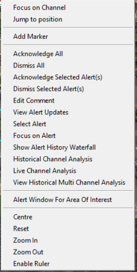
The Alert Control Panel
The Alert Control Panel is displayed on the right side of the map window within the Side Status bar. To access, the User should click on the multi-colour alert symbol and the Side status bar will slide out. The alert panel shows all current alerts on the system and can be quick filtered by alert level. Additional filtering options are available from the funnel icon at the top-right of the alert panel. Alerts that have been dismissed will not be visible, but these can still be accessed through the Historic Alerts tool (See Section 9.3).
Clicking on an alert will highlight. The details of that alert are then displayed below in an alert summary at the bottom of the panel (Figure 31).
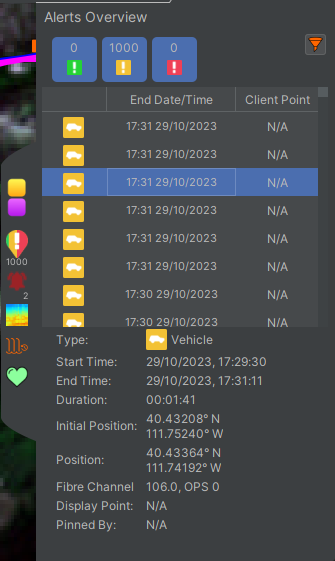
Figure 30: Alert Control Panel.
Each header can be filtered (in increasing or decreasing values) by clicking on that respective header. Additional Headers are available by right clicking on headings row. A list of available headers will then be displayed, which the user can then click on to display the details on the Alert list (Figure 31).
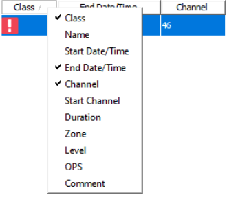
Figure 31: Selecting headers on the alert control panel.
Like the map display, each alert can also be right clicked from the Alert list to access additional functions (Figure 32).
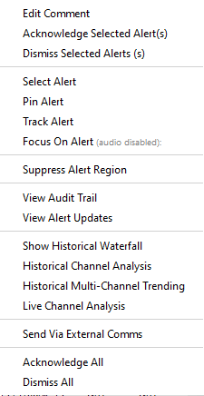
Figure 32: Right Click menu for an alert accessed from the Alert Control Panel.
An acknowledged alert will show up on the Alert Control Panel with the class section no longer highlighted in its respective colour (Figure 33).
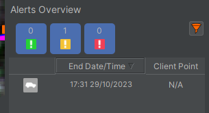
Figure 33: Greyed out icon for an acknowledged alert.
The System Timeline
The System Timeline is a means of gaining a quick overview of what is happening on a system (Figure 34)

Figure 34: System Timeline
The system timeline is a rolling timeline with the current time coverage displayed on the left- and right-hand sides of the timeline. When an event occurs, a symbol appears on the timeline. This can be clicked on to provide more information – below is an example of when an alert is clicked on (Figure 35) and a system event (Figure 36).
Some events will also include subtext. For example, alerts scrolling across the timeline will highlight their centre position.
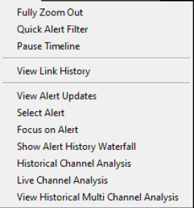
Figure 35: Right-click on Alert.

Figure 36: Right-click on System Event.
The Toolkit
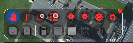
Figure 13: Toolkit on the Map.
The Toolkit is one of the main elements for interacting with the map display. From the top row of the Toolkit, users can:
- Pan: Select to move around the map.
- Ruler: Select to measure the distance between two locations on the map.
- Bounded Historical Search: Select to open a Historical Waterfall/Alert search for an area bounded as drawn on the map.
- Zoom: Click to Zoom In/Out of the map.
- Reset: Click to set the map to the default position.
- Map Cursor: Clickable options to decide how the map cursor and position should behave when focusing on or tracking alerts.
Toolkit Alerts
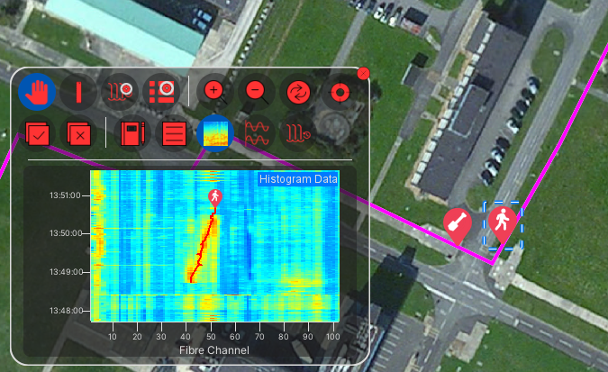
Figure 14: Waterfall Preview on Toolkit displaying the ‘Selected Alert’
Additional options are available from the toolkit that can be used to interact with selected alert(s):
- Ack/Dismiss: Ack and Dismiss the selected alert(s).
- Alert Comment: Comment on the selected alert(s).
- Alert Details: View the alert details within the Toolkit of an single selected alert.
- Waterfall Preview: View a Historical Waterfall image within the Toolkit for a single selected alert.
- Multi-Channel Trending Preview: View a Multi-Channel Trending image within the Toolkit for a single selected alert.
- Historical Waterfall: Open the Historical Waterfall display for a single selected alert.
Alerts can be selected by:
- Map: Clicking on an alert on the Map (the selected alert will be highlighted as seen on the above image).
- Alert Right Click Menu: Use the ‘Select’ option on the Alert Right Click Menu
- Alert Overview Side Status: Highlighted alerts on the Alert Overview are automatically selected.
The OptaSense Surveillance Waterfall Window
The OptaSense Surveillance Waterfall Window visually displays acoustic data along the entire length of the sensing fibre. The data is displayed in real time on a series of acoustic “channels”. Each of these channels usually corresponds to a 10m section of fibre. The channel pitch may vary depending on fibre length, but each channel is always the same length across the whole OPS.
The Waterfall window has two main types of charts: waterfall displays, and histogram displays. There is one of each in the overview and zoom sections of the waterfall window. The lower two charts will always display the entire OPS while the upper two charts can be scaled to look at data in more detail.
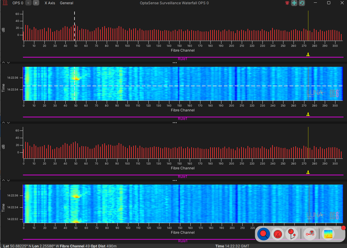
Figure 37: The OptaSense Surveillance Waterfall Window.
Each display on the waterfall window can be adjusted to enlarge or shrink the different components by clicking and dragging the borders of each section. Components can also be minimised and maximised using the arrows on the borders (Figure 38).
Figure 38: Adjusting each display section on the waterfall window.
Waterfall Toolkit
The waterfall toolkit provides easy access to many of the commonly used controls. The toolkit can be minimized by clicking the x in the top-right corner and re-opened by clicking the toolkit icon itself (visible when closed).
- Scaling: The gain levels can be adjusted using the horizontal slider below the scale limit – or by typing in numbers directly into the box (Figure 39). This will affect the histogram displays and the colour scaling on the waterfall displays.
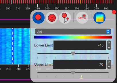
Figure 39: Scaling Function within the Toolkit on the Waterfall
- Mouse Mode:
- Zoom – Allows the user to magnify sections of the waterfall to see the data with greater resolution.
- Create Linear Range/ Detector Area – Allows the user to create new areas by clicking and dragging on the waterfall display. This functionality is only available to higher-level users.
- Measure Speed – Allows the user to draw lines on the waterfall display to determine the speed at which a signal is moving. The units can be selected from the sub-menu (Figure 40).
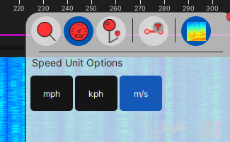
Figure 40: Measure Speed selection with options visible
- Range Coverage: Control what is shown beneath the histogram and waterfall charts: e.g., Linear Ranges, Detector Areas. See Figure 41.
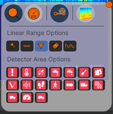
Figure 41: Range coverage options on waterfall toolkit.
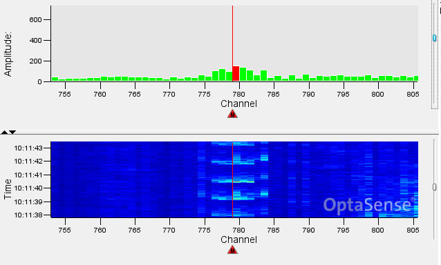
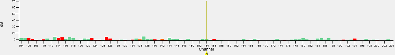
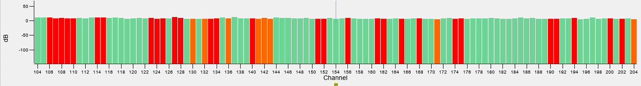
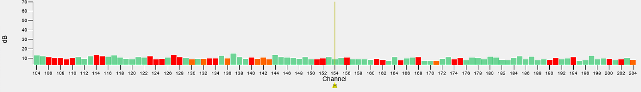
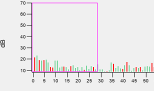
The Histogram
The histogram displays live data along a series of channels. The channels are displayed along the x-axis (the bottom of the chart), and the amplitude of the signals is given along the y-axis (the side of the chart).
The bars display the averaged acoustic intensity in each channel (larger amplitudes indicate greater energy). A red bar indicates that there is an unacknowledged alert on a channel.
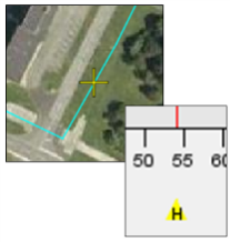
To relate an area to a position on the map, right click on the waterfall or histogram next to the desired focal point, select “Focus on Channel X” (Figure 42). The zoom histogram will then centralise on the channel selected, and the yellow highlighted cross will be displayed at that same location on the map display. This also works the other way around through right clicking on the map window.
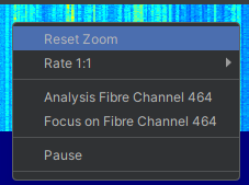
Figure 42: Selecting Focus on Channel from the Histogram
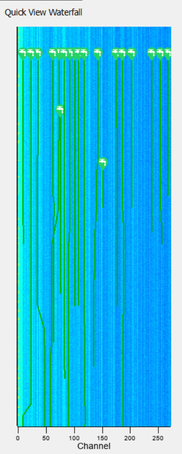
The Surveillance Waterfall
The waterfall chart displays represent a historical display of the histogram above it. The data is displayed across the optical channels in the same way as the histogram (Figure 43). However, the y-axis now represents time, and the colour of the data represents the amplitude. Generally, low amplitude signals are represented by a blue colouration and higher amplitude signals are shown in red. The colour scheme for the waterfall can be changed. As with the histogram, the Waterfall functionality is split into both overview and zoom windows.
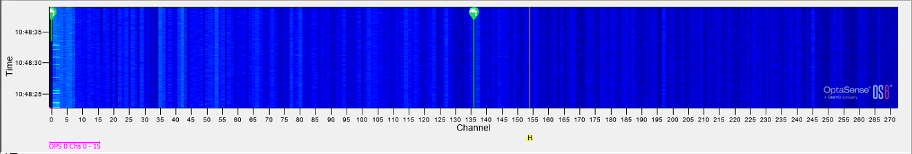
Figure 43: The Waterfall
The amount of data on the display can be configured through the right click menu. A rate of 1:1 will display the smallest amount of time compared to a rate of 1:64, which will display the greatest amount of time. Different events are easier to visualise over different timeframes. For instance, a person walking will be most clearly visible over a short timeframe while the movement of vehicles can be easier to interpret over longer timeframes.
Note that the upper zoom window can be selected from all the individual panes – zoom and overview, waterfall, or histogram. It is important to note that the upper zoom views are always correlated; the user cannot select different zoom channels within the histogram and waterfall for example.
Optimising the Displays
 | Not Enough Gain – Some Very Strong signals are only just visible |
 | Too Much Gain – Lots more data is visible but some data from early channels is extending above the range of display |
 | Correct - full scale of all data is visible |
Figure 44: Adjusting Histogram Magnification Waterfall Effects
A method for selecting the optimal histogram magnification is to set the sliders within the range of the data OptaSense is processing. Typically, this is between 0 – 30dB. If these figures are not known, adjust by eye for the channels of interest. A good approach to getting this right is to get the range of interest visible within the histogram by setting numbers appropriate for MIN and MAX – concentrate on the output – not the sliders.
The sliders have a “repeat” action and the starting point for a subsequent use of the slider will be the previous limit. Type in a value to reset or open a new waterfall.
Some displays use the same scaling, which means that scaling values will always be the same across these displays. Any changes to the scaling made on one display will be reflected on the other.
The displays which use the scaling locking include:
- Waterfall Histogram
- Surveillance Waterfall
- Side Panel Surveillance Waterfall
The scaling is unique to each OPS on the system.
Waterfall contrast levels
The amplitude display on the waterfall is also controlled with the sliders in the zoom and full panel controls accessed from the Zoom and Full Properties menus at the top of the surveillance window seen in (Figure 45). This acts in the same way as the slider for the histogram. However, the resultant change in display will appear much differently. An increased gain in amplitude effectively changes the colour of the waterfall.
 Contrast level too low – signal is hardly distinguishable from the background noise Contrast level too low – signal is hardly distinguishable from the background noise | 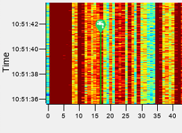 Contrast level too high – both signal and background noise have nearly the same appearance Contrast level too high – both signal and background noise have nearly the same appearance |
 Contrast level OK – digging signal clearly visible against the background levels Contrast level OK – digging signal clearly visible against the background levels |
Figure 45: The effects of changing the waterfall contrast levels.
Zoom Function
To zoom in on the display on the histogram, click and drag a box anywhere on the histogram or waterfall windows while the mouse functionality is set to zoom. The top histogram and waterfall panels will zoom to this range. Note that the overview panels will always show the full range and the current zoom range will be indicated on them.
 |
|---|
Figure 46: Click and drag a rectangle to zoom in on the histogram.
At any time, right click and select “Reset Zoom” on the histogram (or waterfall) to zoom out.
Additional Functionality
Cursor Information
Details on the position of the cursor on both the waterfall and histogram charts will be visible at the bottom of the window. Information includes the channel, the Latitude and Longitude and the Optical Distance at the position of the cursor. If the system has a custom layer (such as KP for pipelines) then this information will also be displayed.
 |  |
|---|
Figure 47: Cursor location information on both the waterfall and histogram
Menu Options
Across the top of the OptaSense Surveillance Waterfall are various control Options for the waterfall
| OPS | Allows the User to select the OPS to be displayed. The arrows provide easy switching between OPS. | |
| General | Allows the user to toggle between whitened/non whitened data. Toggle on/off alert tracking on the waterfalls. Toggle the visibility of Zones/Areas. See Section 6.4.4 Can also React to a Focus Request Focus Alert Focus Position Track Alert | |
| X Axis | 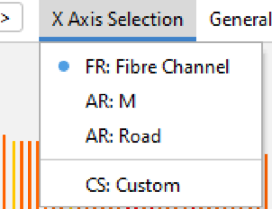 | Allows the User to change the units of the horizontal scale. Any Detector Route (Asset, Fibre) or Client Scale available on the selected OPS can be used. |
Zones
The zones are represented along each of the displays on this window. They will correlate with the zones shown on the map display.
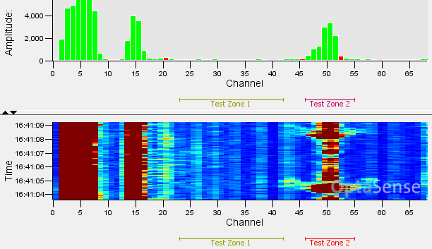
Figure 48: Zones shown on the surveillance waterfall window.
Waterfall Marker
Markers are visible along the bottom of the waterfall and histogram charts. These are different to the markers on the map window; they are in reference to events along the fibre and relate only to parts of the fibre.
    | Channel Highlight The channel highlighted on the map window will be shown underneath the waterfall and histogram displays using this marker. |
|---|
Right click functions
Both the histogram and the waterfall charts can be right clicked. The following options will be accessible:
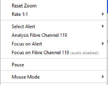
Figure 49: Right Click options on the Surveillance Waterfall Window
| Reset Zoom | This resets the zoom levels on both the overview and zoom waterfalls back to show the whole OPS |
| Rate | Determines the period of time that can be displayed on the waterfall. |
| Focus on Fibre Channel ‘X’ | ‘X’ refers to the point number where the mouse was clicked. The Map Display and Surveillance Waterfall will snap to centre the selected channel. Markers will be placed both on the histogram and the Map Display to highlight the channel. This also combines the Listen to channel function |
| Focus on Alert | This will focus and highlight both the map and waterfall onto the nearest alert to the position of the cursor. |
| Analysis Fibre Channel X | This will open an analysis window giving advanced audio information on the selected channel. Depending on the user level this option may or may not be available. |
Waterfall Colour
The colour scale for the waterfall can also be modified from the control panel, the system default is Jet. These can be selected according to operator preference.
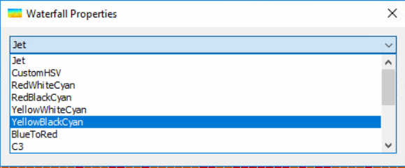
Figure 50: Waterfall Colour Selection.
The “Heat” and “C3” colour options have a lower dynamic range than the other options.
Side Waterfall
A further option that is available to the User is the Side/Quick View waterfall. This is accessed by clicking the waterfall logo on the sidebar (Figure 51).
 | |
|---|---|
| (a) Side waterfall opening logo | (b) Side Waterfall |
Figure 51: Opening and viewing the side panel Waterfall.
The Side panel waterfall has some of the common functionality of the full waterfall. These can be accessed by right clicking on the window.
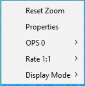
Figure 52: Right Click on Side Waterfall
| Reset Zoom | The Side waterfall allows the user to zoom in, in the same way as the full waterfall. This allows the User to rest this zoom |
| Properties | This allows access to the functions described in 6.4.7 and 6.4.8 |
| OPS X | Allows the user to change the OPS being displayed on the side waterfall |
| Rate | Allows the User to adjust the update rate of the waterfall |
| Display mode | Allows the User to toggle between the configured modes |
Additional OptaSense Functionality
Alert Window
The Alert List Window will display all active alerts from the system (Figure 53). It acts in a very similar way to the alert window on the map window but has greater functionality. The alert window is accessed within the main toolbar under live analysis. It shows greater information about each alert.
Similar to the Map display, there is an associated Toolkit, that allows easy access to the most common actions
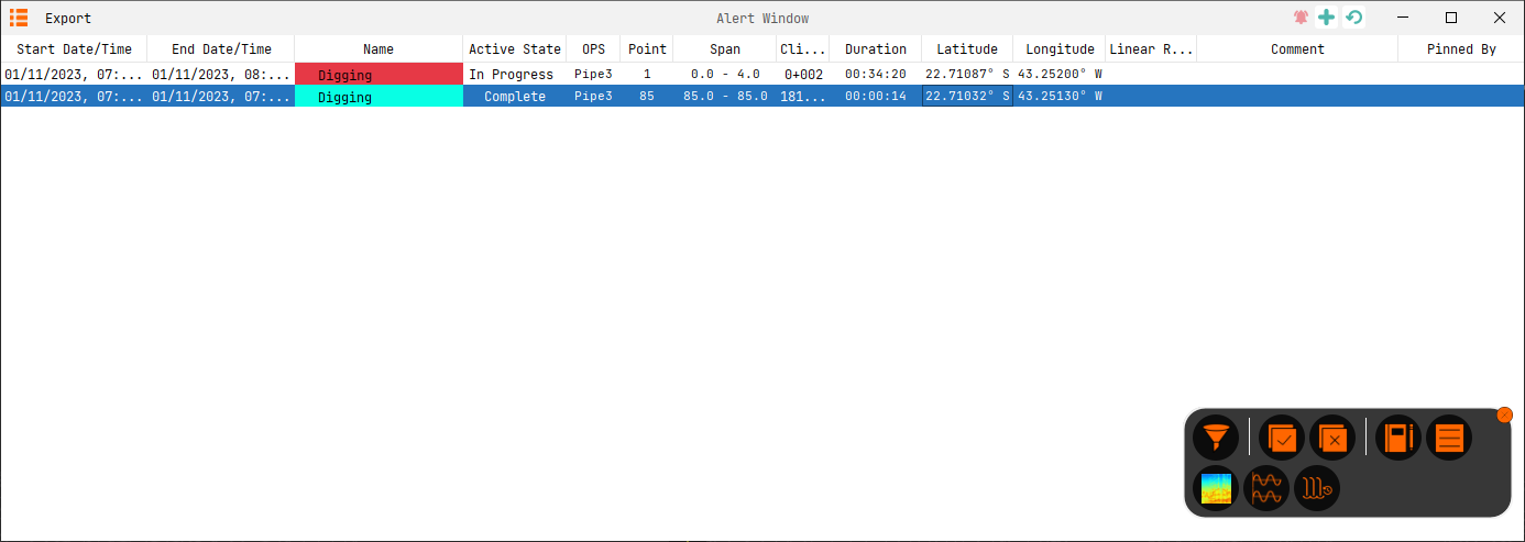
Figure 53: The Alert List Window
The visible headers can also be customised by right-clicking on a header to get a list of available headers. Click on a header to then sort by ascending/descending order. It is also possible to filter against any available headers.
The ordering and choice of columns can be stored when saving current view as user profile.
Audio Control Window
| The Audio Control Window provides the user with a variety of tools to modify the audio settings on the system. Once clicked, it will open a simple volume fader which controls the master volume of the system. If set too high the audio may distort and the “Out of Range” light will light up. If this occurs, turn down this slider until the light is no longer on. | |
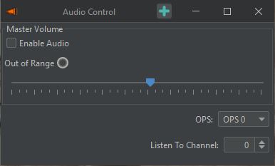 Figure 54: Audio Control Window. Figure 54: Audio Control Window. | Master Volume Controls the volume of the system created sounds. Enable Audio This acts as a “mute button” for audio data. If this is unchecked, no sound will be observable from any channel of the system. Jump to newest Alert The audio will be played from the channel of the latest alert. If this alert updates to a different channel, or a new alert begins, the audio channel will automatically switch to the newest update. |
The Audio status is available on the main GUI toolbar where it can be enabled/disabled.
![]()
Recording and Replaying Data
The system can record and replay data. The functionality is restricted based on user level with only Trained Users being able to replay data. Light Users are unable to record or replay data. If this has been enabled, then the button will be visible on the toolbar. Selecting the “Make a new Recording” button from the Record & Replay tab (Figure 55) on the main toolbar will bring up the window shown in (Figure 56).
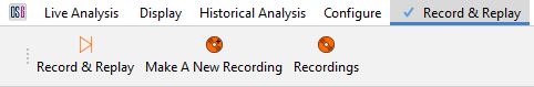 Figure 55: Record & Replay Menu. Figure 55: Record & Replay Menu. |
|---|
Recording
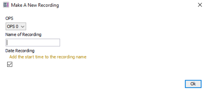
Figure 56: Record Window.
Before a recording is made it’s important to select which OPS the activity is going to be recorded from, it’s important to choose a suitable name so that it provides a good reference to what’s going to be recorded. For example, the Channel/KP point and type of activity.
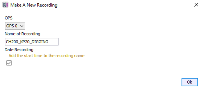
Figure 57: Recording Name Completed.
Once the name is provided and OK is selected, the recording will begin. The dialogue box will disappear, and an indication will appear to indicate that a recording is in progress. Clicking this shows more detail (Figure 58). The sidebar can be used to stop the recording.
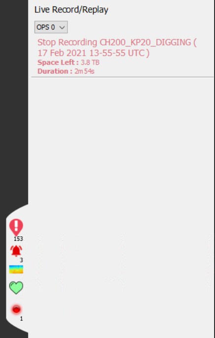
Figure 58: Sidebar – Recording in progress.
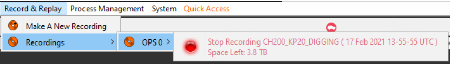
Figure 59: Stop Recording via Menu.
Whilst recording there is an option to log manual events. Logging an event provides a reference point within the recording to note where an event of interest happened. To mark an event, select the Add Event button as shown in (Figure 60), accessed by right clicking the recording in the sidebar This will bring up the box shown in Figure 61 where a description of the event can be added. Selecting OK will place the marker.
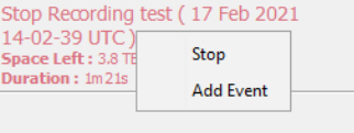
Figure 60: Add Event.
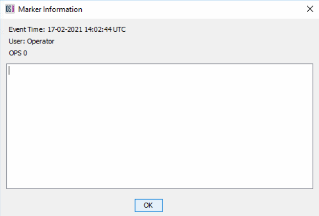
Figure 61: Event Log Description.
User Profiles
Profiles allow Users to arrange the customise their display and then save that arrangement so that it can be recalled at any time, including when logging on to the system. The procedure for setting up a profile is detailed in Figure 62.
 | Click on the Username (in this case User) in the top right corner of the Map window and selecting the option to Save Current View as User Profile |
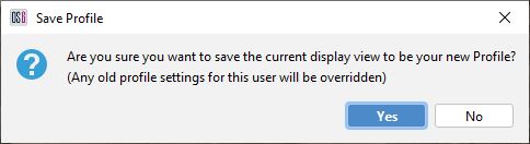 | Confirm you wish to save this view by pressing yes |
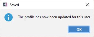 | Confirmation the save has been made |
Figure 62: Creating a Profile.
Once a profile has been generated, upon each login to the software, the profile will automatically open.
Recall Profile
If there is a profile for a user, this profile can be recalled (Figure 63). This will close any open displays and re-apply the saved profile.
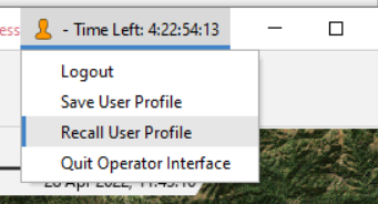
Figure 63: Recall Profile menu option on the Overview Window.
Restore Defaults
Where users have made layout and visualisation changes it is possible to restore the window to the default settings by pressing the Restore Defaults (![]() ) button. The button can be found in the top right of the window as highlighted in Figure 64. Pressing this button will restore visual settings to defaults but will not make any changes that affect the underlying processing of the system. For example, the dynamic range of the charts will be reset but any changes to the frequency band of interest will not.
) button. The button can be found in the top right of the window as highlighted in Figure 64. Pressing this button will restore visual settings to defaults but will not make any changes that affect the underlying processing of the system. For example, the dynamic range of the charts will be reset but any changes to the frequency band of interest will not.

Figure 64: Waterfall display highlighting the ‘Restore defaults’ button.
System Health
The system health window can be accessed by clicking on the System on the main menu bar (Figure 65).

Figure 65: System Health Icon.
This window provides information on all components of the system, both hardware and software. Within each window there are graphs which show a variety of different diagnostics (Error! Reference source not found.):
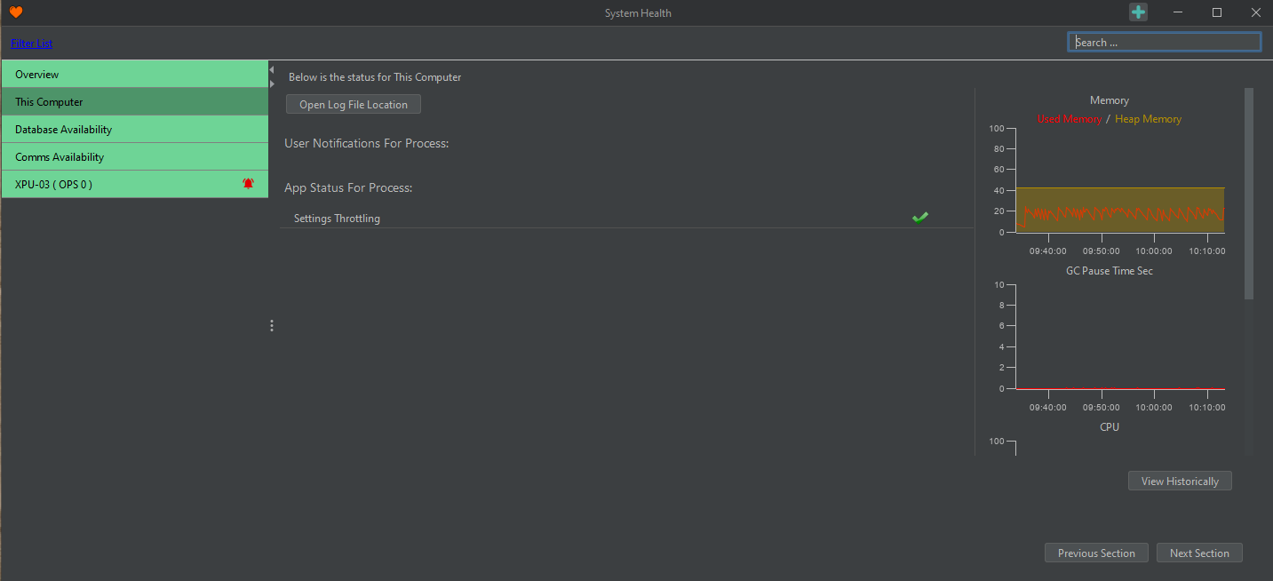
Figure 66: System Status Window
 | |
 |
By clicking “Filter List” in the top left, only Processing Nodes with errors are shown. This is very useful when operating a large system. The full functionality of this is described in the Module 10 guide.
System Health on Toolbar
The System Health light on the left-hand side toolbar will focus the User’s attention to any potential error messages or warnings (Figure 67).
 | |
| System functioning correctly | System Error |
Figure 67: System Health Status Bar
Database Availability
This section details the connection state of the distributed database (PUs and DPUs) on the system (Figure 68).
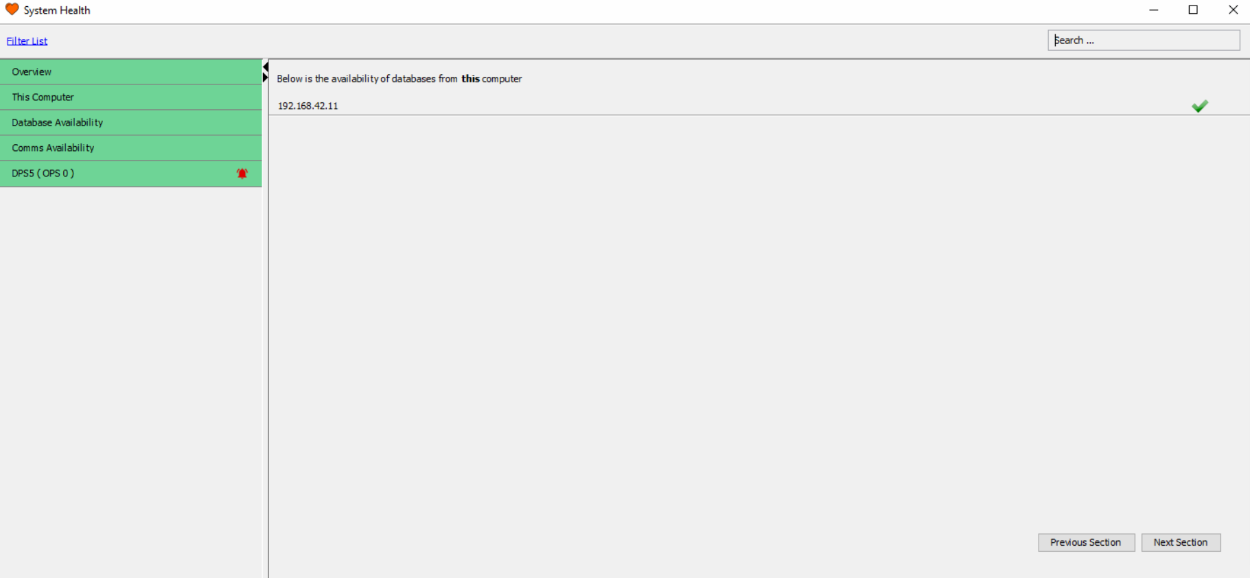
Figure 68: Expanded Database Availability view.
Comms Availability
The first section details the connection state of all nodes (Dual) Processing Units on the system (the content is near identical to the Database Availability - Figure 68). It provides a system overview and may indicate a power or network connection problems at a specific site.
Node Status Overviews
The number of sections after the local logs section is dictated by the number of nodes processing units or dual processing units the system comprises (Figure 69). Each section can be expanded by clicking the banner.
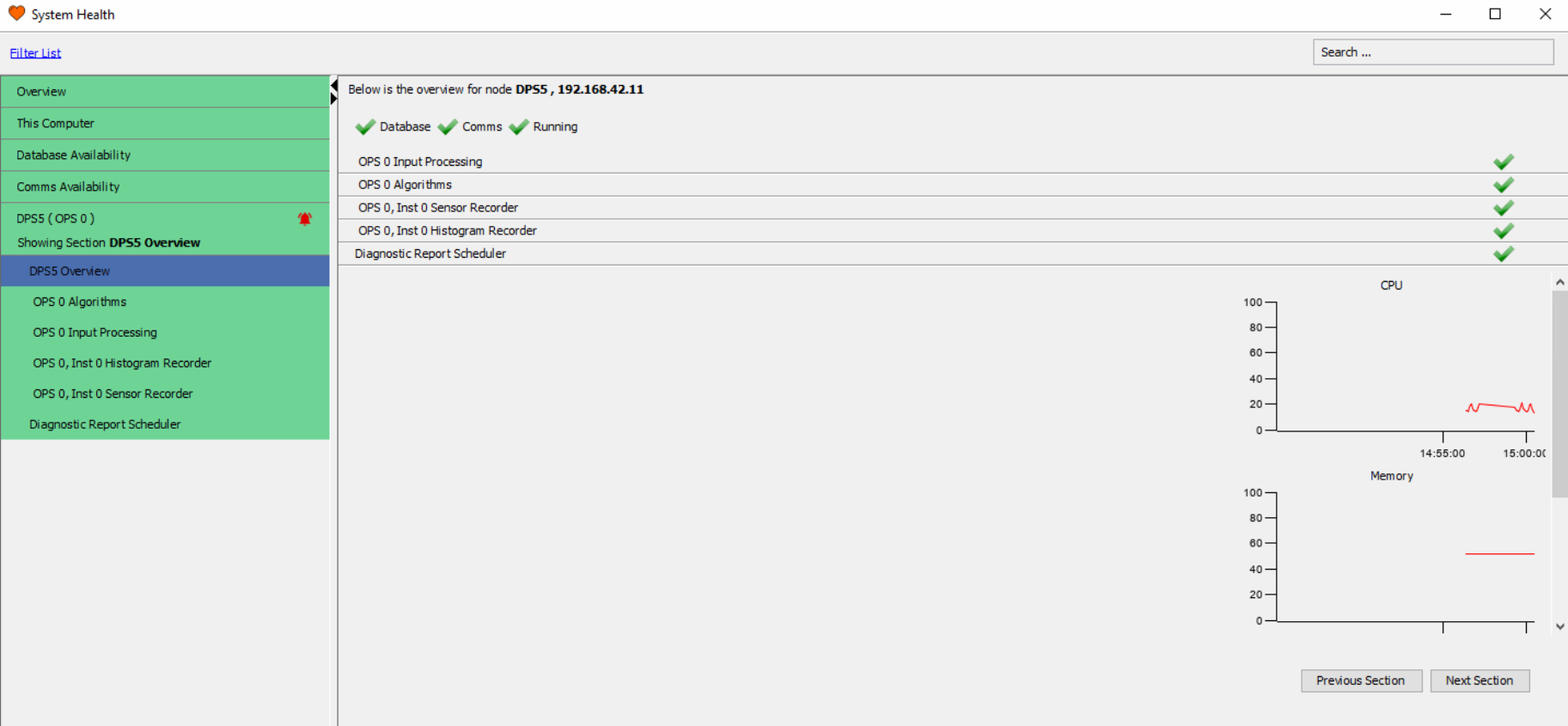
Figure 69: Processing Node Status overview
Resource Monitoring
On the right side of the System Health window, there are charts that provide an overview of status of resources. Process report charting enables the user to select what resources they want to monitor. Resource monitors include:
CPU %: This is the demand on system processing. The higher the red line, the harder the CPU is working to service the system.
Memory %: This shows the systems demand on memory. The higher the red line the more the system is using.
OS Disk Space: This depicts how much of the drive on the server is being used.
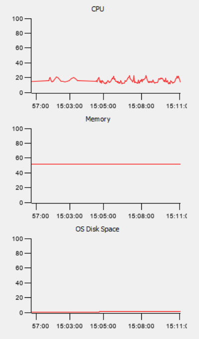
Figure 70: Resource Monitoring
System Summary Overview
On the toolbar in the operations tab is the system Summary View Window. Click on the green heart shown in (Figure 71)
![]()
Figure 71: System Summary Overview Window
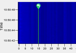
This panel shows the system health and gives a graphical representation of the system processing chain with information relating to the selected OPS (Figure 72). As the data is received by the interrogator unit it flows downstream through the processes represented by the green circles. If any of the processes are in an error state it will be reflected in the display.
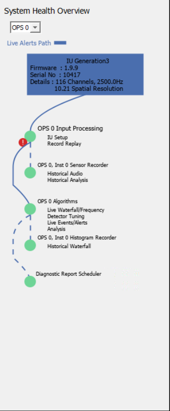
Figure 72: System Health Overview Window
Alert Management
Once the system has been installed and tuned, alerts will appear in response to the correct stimulus and may need to be investigated. Of crucial importance is the need to understand that the alert that appears may not identify malignant behaviour – rather it identifies behaviour that aligns with the type of alerts detailed within the threat profile. Correct use of the tools allows the User to observe and review the data in a timely manner allowing a full alert to be declared only when there is sufficient evidence built up to warrant a ground investigation.
The system will be tuned to minimise nuisance alarms while maintaining a high probability of detection. As Users become familiar with typical behaviour along their asset, they will quickly learn to differentiate interesting behaviour from the mundane. Most typical linear assets will produce a few alerts per week – but this depends wholly on the nature of the background – for example, in areas of arable farming where digging is considered a threat, the number of digging alerts will likely be considerably higher than in a remote, unfarmed area.
How Alerts Appear
An alert will appear on the map window as an icon indicating its location along the fibre. The icon itself will identify what type of alert has been created.
Figure 73: An alert as it appears on the map.
Various alert icons (Figure 74) are available to indicate examples of different activities: (from left to right) Activity, Leak, Mechanical Digging, Personnel, Pig Tracking, Train, Hot Tapping, Vehicle, Manual Digging, Landslide Detector, Seismic Activity Fibre break and Fence Activity.
![]()
![]()
![]()
![]()
![]()
![]()
![]()
![]()
![]()
![]()
![]()
![]()
![]()
Figure 74: The OptaSense alert icons.
A corresponding line of information will be displayed on the alert list to the right of the map if the alert is red (Figure 75).
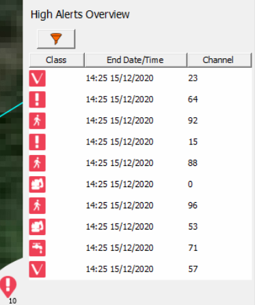
Figure 75: The alert displayed in the alert list with a summary beneath.
Alerts are also published to the system timeline, as shown in Figure 76.

Figure 76: The alert displayed on the System Timeline.
When there is an unattended CU, the CU can be configured to issue an audible and visual alert if required.

Figure 77: The side panel display turns red when the CU is left unattended.
An alert can be acknowledged or dismissed through the System Health bar on the map window by right clicking. Once acknowledged, an alert will be grey on the alert list. If an alert is dismissed, it will no longer be visible on the alert list unless that alert continues to update (i.e., the activity is still occurring).
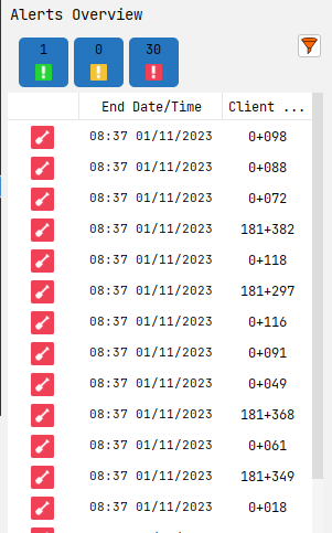
Figure 78: The pre-alerts section on the System Health Bar panel
Tracked Alerts & Focus Events
Various displays can:
- “track” alerts
- react to a user highlighting/focusing on an alert or position.
These options are set on a per display basis (e.g., two waterfalls open with different options for each). These options are remembered in Profiles.
Compatible displays are detailed below.
Map
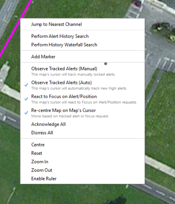
Figure 79: Map Tracked Alerts and Focus Events Options
Four options are available for this display:
React to Focus on Alert/Position
Use this option to reposition the map cursor when ‘Focus on Alert’ or ‘Focus on Position’ options are used.
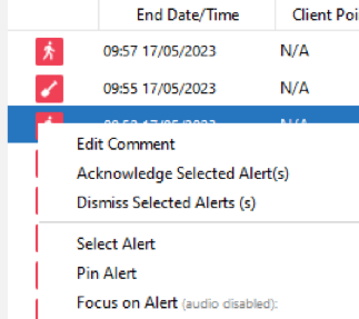
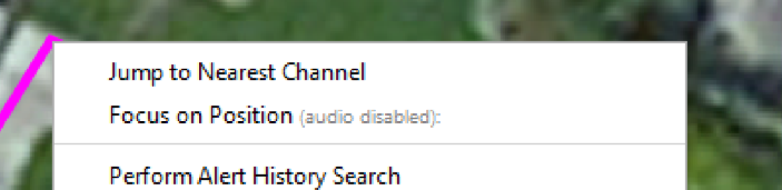
Figure 80: ‘Focus on Alert’ on Alert Menus and ‘Focus on Position’ on Map right click.

Figure 81: The Map Cursor.
Observe Tracked Alerts (Manual)
If there is an active detection of high importance, users can select “track” via Alert Right Click Menu. Any displays with manually tracked alerts enabled will follow/track this alert. Once the Alert is in a ‘completed’ state or dismissed it will no longer be followed/tracked
For the Map display, it will move the map cursor to the tracked alerts center position.
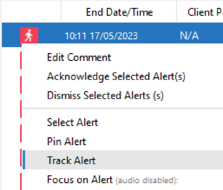
Figure 82: ‘Track Alert’ option on the Alert Menus.
Observe Tracked Alerts (Auto)
If all high alerts are required to be tracked, the ‘Observe Track Alerts (Auto) should be selected. Any displays with ‘Observe Track Alerts (auto)’ enabled will track/follow any new high alert automatically.
For the map display it will move the map cursor to the tracked alerts center position.
Re-center on Map Cursor
If users wish to also automatically re-centre the map to the cursors position, ensure the ‘Recentre Map on Map’s Cursor’ option is selected.
Surveillance and Side Waterfall
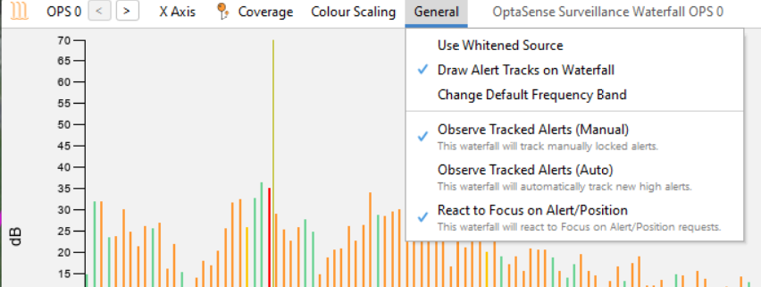
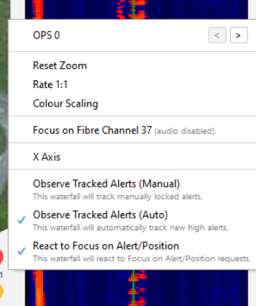
Figure 83: Surveillance & Side Waterfall Tracked Alerts and Focus Events Options
Options available for these displays are:
- Observe Tracked Alerts (Manual)
- Observe Tracked Alerts (Auto)
- React to Focus on Alert/Position
These options behave in a similar manner to the Map display, but the option ‘Re-centre Map on Map’s Cursor’ is not available. Instead, the waterfalls will adjust the viewable range as well as the waterfall cursor/highlight.
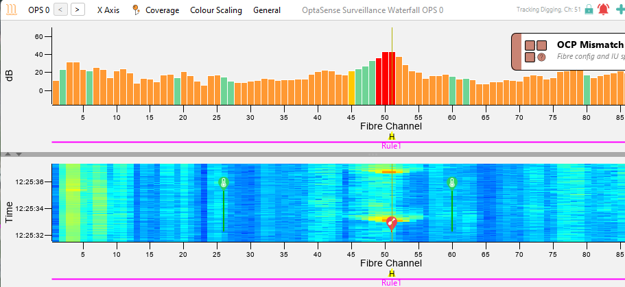
Figure 84: Waterfall Tracking alert
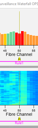
Figure 85: Waterfall Cursor/Highlight
Alert Displays
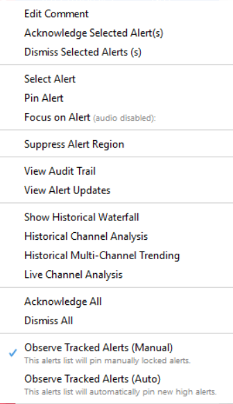
Figure 86: Alert Overview & Alert List Tracked Alerts Options
Most alert displays make use of the observe track options by selecting the Alert Right Click Menu. When observing tracked alerts (manual or auto) is selected, the alert display will automatically pin the alert.
Alert displays do not make use of the React to Focus on Alert/Position’ option seen on other displays.
History Extraction
All historic alerts, audits and processing reports can be accessed on the Historical Analysis option from the top menu. The historical availability will vary depending on customer requirements, but this can be amended by an administrator level or above user.
The Historical Analysis option from the top menu allows the User to access tables of various data as described below over a selected time period.
Historic Waterfall Data – this is described in Section 9.4.
The multi-channel trending tool enables the user to plot histogram and leak data recorded on the system at a given date / time.
There are 2 ways this feature can be accessed.
-
From the toolbar select Historical Analysis, then Multi Channel Trending.
-
Highlight an alert and access the right click menu, then select Historical Multi-Channel Trending

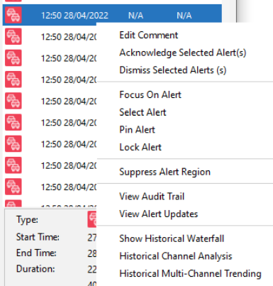
Figure 87: Left - Historical Multi Channel Analysis / Right - Selecting the Feature from Alert
Notice in the window below a line graph is already plotted. This is because the source of data was selected off the back of an alert. To manually choose a source, click Add Source. Scale Options enable the time of the source to be edited. The Fibre Channel menu allows additional channels to be plotted within the same window.
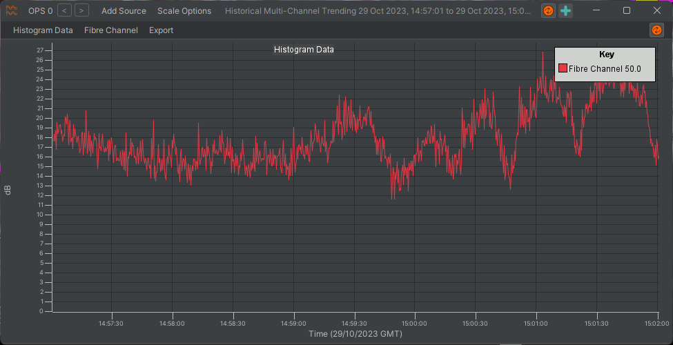
Figure 92: Analysis Option
Historical alerts provides a tool to recall alerts generated on system. Displayed alerts can then be exported into a chart format. To access this feature, from the toolbar select Historical Analysis and then Historical Alerts.
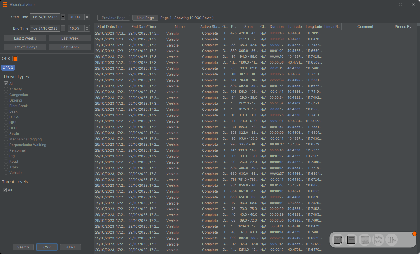
Figure 89: Historical Alert List
From the toolbar on the left side the user can select the duration the report should cover. The user can also select the level of alerts (low, medium or high), filter specific alert types, and span the search over multiple OPS. Press Search to run the report.
Once the report has been generated, the user can extract the report to either CSV or HTML format.
Historical Alert Extraction
There are two options for exporting alert data.
The CSV button will export alert data into Comma Separated Variable file format. Once the button is clicked, a prompt will ask you to confirm the export, select yes. Choose the desired location and click save. Another prompt will appear confirming that the export has finished.

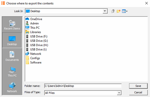
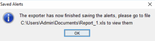
Figure 90: Exporting Alert Search to CSV.
The HTML button will export the data into a web page format. Once the button is clicked, choose the desired location and select Open. Now select the required charts from the chart option dropdown box or select Add All. Select Generate to compile the report.
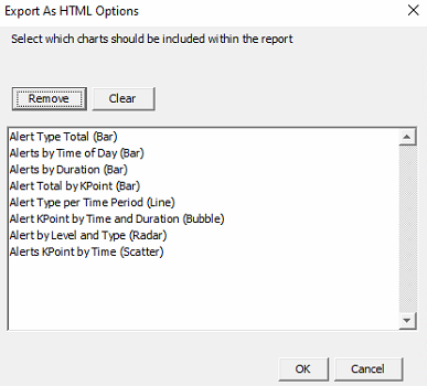
Figure 91: Exporting Alert Search Query to HTML.
Once the report has finished the following prompt will display.

Figure 92: Confirmation of Successful Report Generated.
The contents of the zipped file will need to be extracted in order to view its contents.

Figure 93: Unzipping Report to Run in Browser.
Once extracted, navigate to the AlertReport.html file. Right click on it and open with a web browser such as Google Chrome.
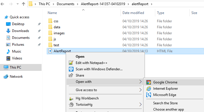
Figure 94: Opening Report in Browser.
Alert Charts
There are three tabs on the top left of the browser.
Charts -Displays a list of charts
Waterfall -Provides a histogram waterfall based on the duration selected in the alert search query.
View -Selecting Default will change the view mode to extended. This provides increased viewing focus on charts. Theme: Changes the white borders of the webpage to grey.

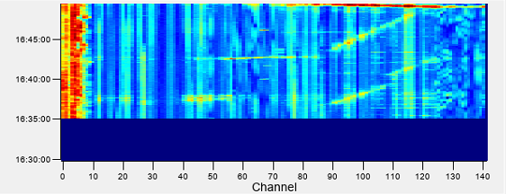
Figure 95: Charts that can be Selected.
Chart Types
Alert Type Total (Bar)
Provides a bar chart of all alert types irrespective of level (High, medium & low).
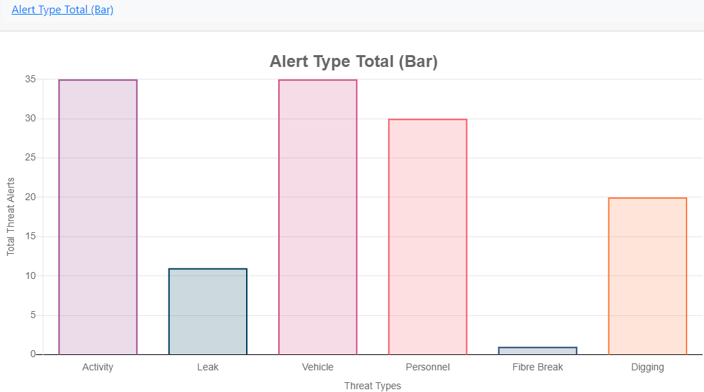
Figure 96: Alert Type Bar Chart.
Alerts by Time of Day (Bar)
Displays a total number of alerts per time period (in this case hourly over 24 hours).
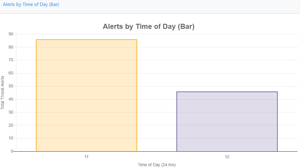
Figure 97: Alerts by Time of Day.
Alerts by Duration (Bar)
Gives an insight into how long the different alert types are updating for.
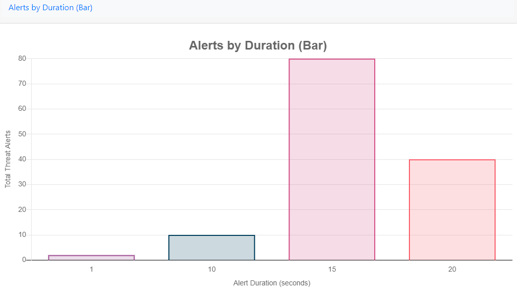
Figure 98: Alerts by Duration.
Alert Total by KPoint (Bar)
In this chart alerts are grouped and displayed against what K Points they were generated in.
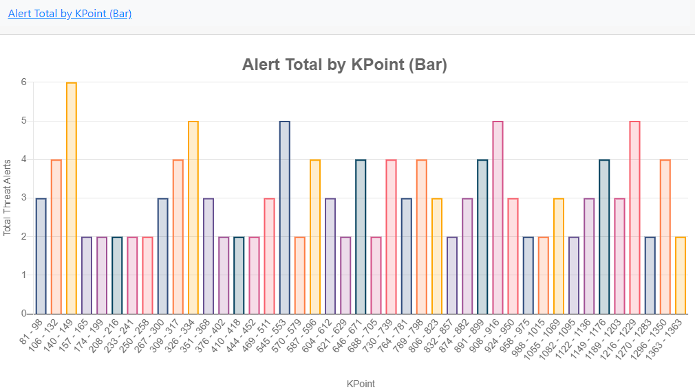
Figure 99: Alert Total by KPoint.
Alert Type per Time Period (Line)
Shows what alert types were raised over a time period (in this case over one hour) and whether that amount increased, decreased or stayed the same.
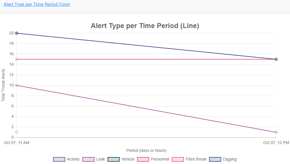
Figure 100: Alert Type per Time Period.
Alert KPoint by Time and Duration (Bubble)
Displays alerts against the KPoints that they were generated in and over what time period they occurred (in this example, over an hour). The bigger the bubble the longer the alerted lasted for.
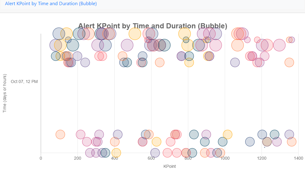
Figure 101: Alert KPoint by Time and Duration.
Alert by Level and Type (Radar)
Shows all alert types raised by type and level.
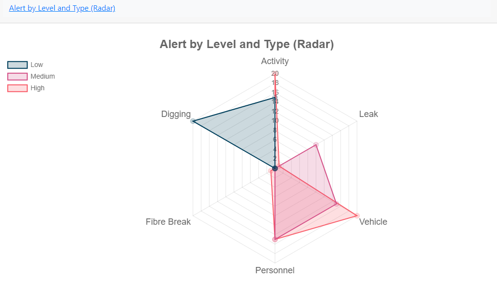
Figure 102: Alert by Level and Type.
Alerts KPoint by Time (Scatter)
Displays alerts against what KPoint they were generated in and over what time period they occurred (in this example, over a day).
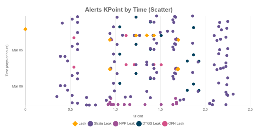
Figure 103: Alerts KPoint by Time (Scatter).
Audits
Historical Timeline enables the user to audit all changes made to system and by whom. To access this feature, from the toolbar select Historical Analysis and then Historical Timeline.
From the toolbar on the left the user can select the duration they require to run the audit on. By default, all nodes, actions and by whom they were made by will be selected.
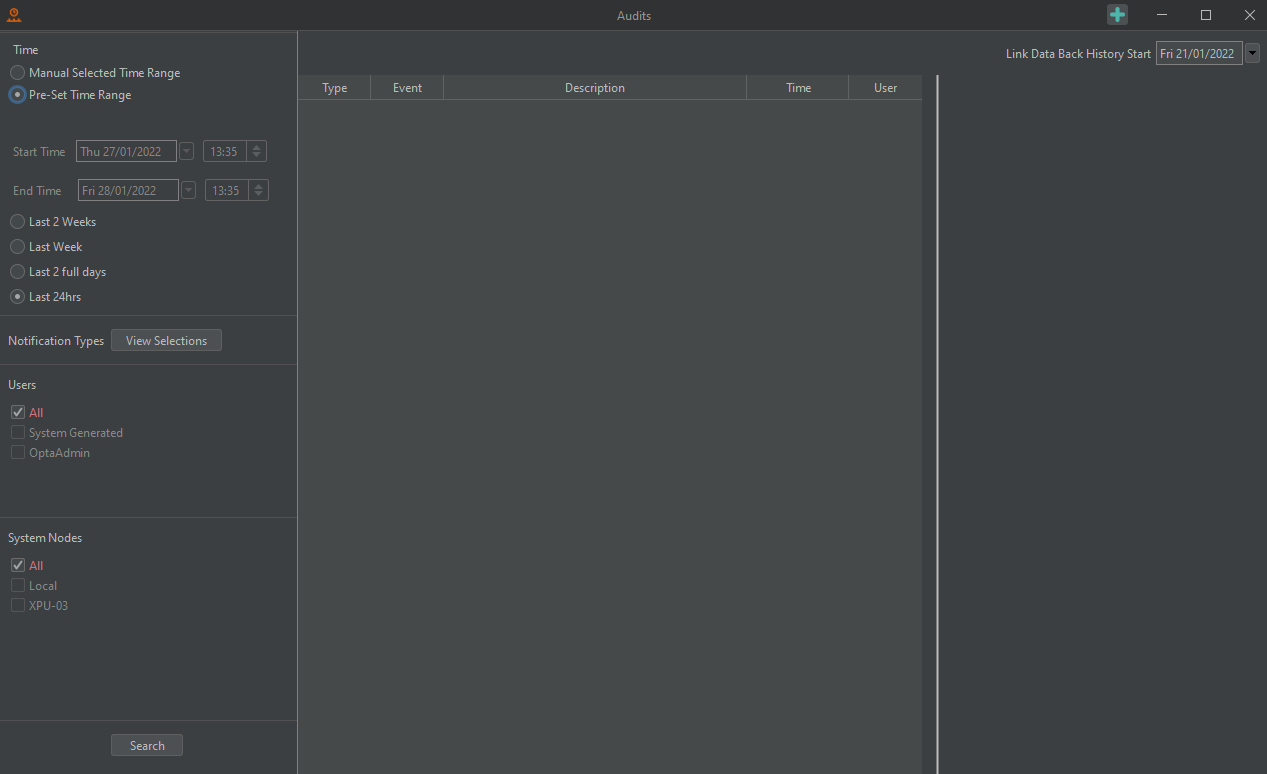
To change what actions are to be listed, select View Selection as shown in the image above. Highlight the events to be audited as required.
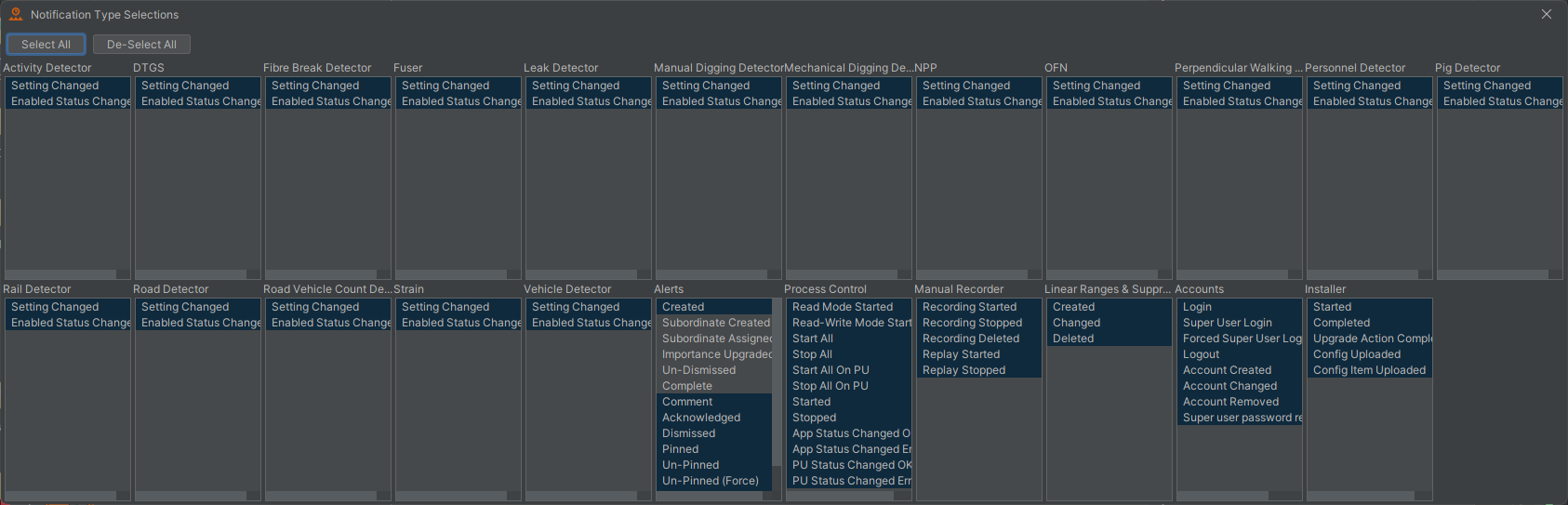
Figure 104: Audit viewer list
Press Search to run the audit. To display more information on an instance, either hover over or select it. Notice on the right side, a full timeline of the occurrence is shown. To quick filter, use the search box and type the name of action / user required. The column headers can also be used to filter. For example, selecting type will order the list of actions by the type of instance.
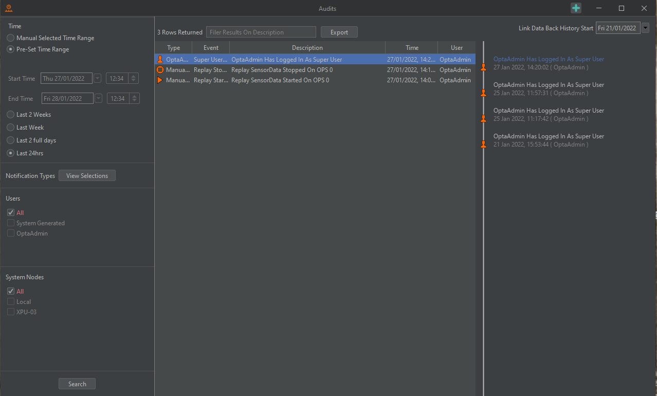
Figure 105: Audit List
Audit Trails
Along with seeing audits in the format seen in Figure 108, audit trails/linked audits can also be viewed. Audits that are linked normally share a characteristic like an identifier or name so that the change history for that link can be seen overtime. An example of this is viewing an alerts' audit trail overtime to see when it was created, updated, or acknowledged etc or to see the change history of a Detector setting.
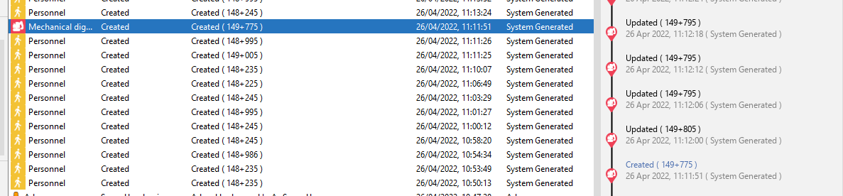
Figure 106: Audit Trail for an audit in the Audit Window.
The first way to view a trail for an event is to use the Auditing Window as seen in Figure 106. In this display, when a row is selected, the audit trail for that row is shown to the right with the selected row in that trail highlighted in blue.
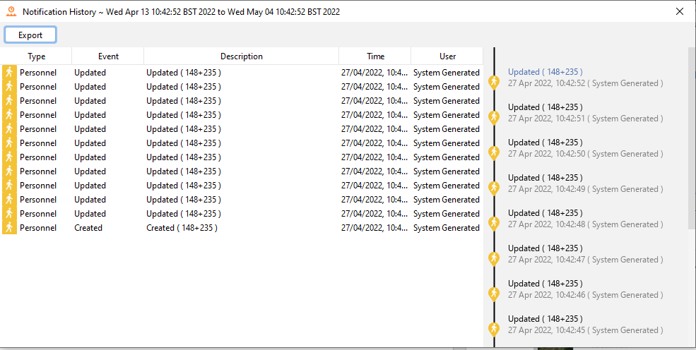
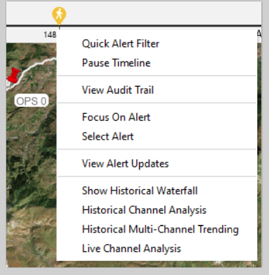
Figure 107: Audit Trail for an audit in the Audit Trail Window.
The second way to view the trail for an event is to use 'View Audit Trail' menu seen on the Live Timeline Menu and Alert menu (Totes, Map etc). This option will open a display in which the audit trail will show for the selected event. This display will list the audit trail in table form and in a format like Figure 107. This display also allows the trail to be exported to csv.
Process Metrics
Process report charting enable the user to select what resources they want to monitor. Explanations for each resource include,
- Memory %: This shows the systems demand on memory. The higher the red line the more the system is using.
- CPU %: This is the demand on system processing. The higher the red line, the harder the CPU is working to service the system.
- GC Throughput %: This depicts how well the system is cycling memory garbage collection. The lower the red line, the more the system is struggling to recycle the memory garbage.
- GC Pause Time Sec: This shows any pauses in the system dumping memory. The more consistent the red line the better the system is dumping its unwanted memory garbage.
To access this feature, from the toolbar select Historical Analysis and then Historical Process Metric.

Figure 108: Historical Process Metric
From the toolbar on the left the user must select the required node, monitoring period and what processed are to be displayed as plotted charts. It’s advised that continuing spikes, dips or absent periods be investigated.
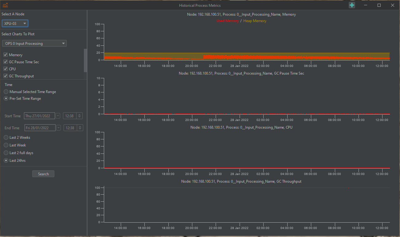
Figure 109: Process Report Charting.
History Waterfall Data
The Alert History Waterfall can be accessed from various areas of the system. Most notably through use of the right click functions on both the map section of the map display and through alert lists. It can also be accessed via the menu option Historical Analysis.

Figure 110: Alert History Waterfall.
Select the required OPS, Rolling Recorder data type, date/time, and range of the data you wish to retrieve (Figure 111).
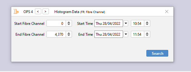
Figure 111: Selecting data based on OPS, date / time & channel range.
Select the required time and channel range then click “Search” and wait for the resultant waterfall image to load. The Historic Waterfall Data will display the selected time and channel range as a waterfall in a new window (Figure 112).
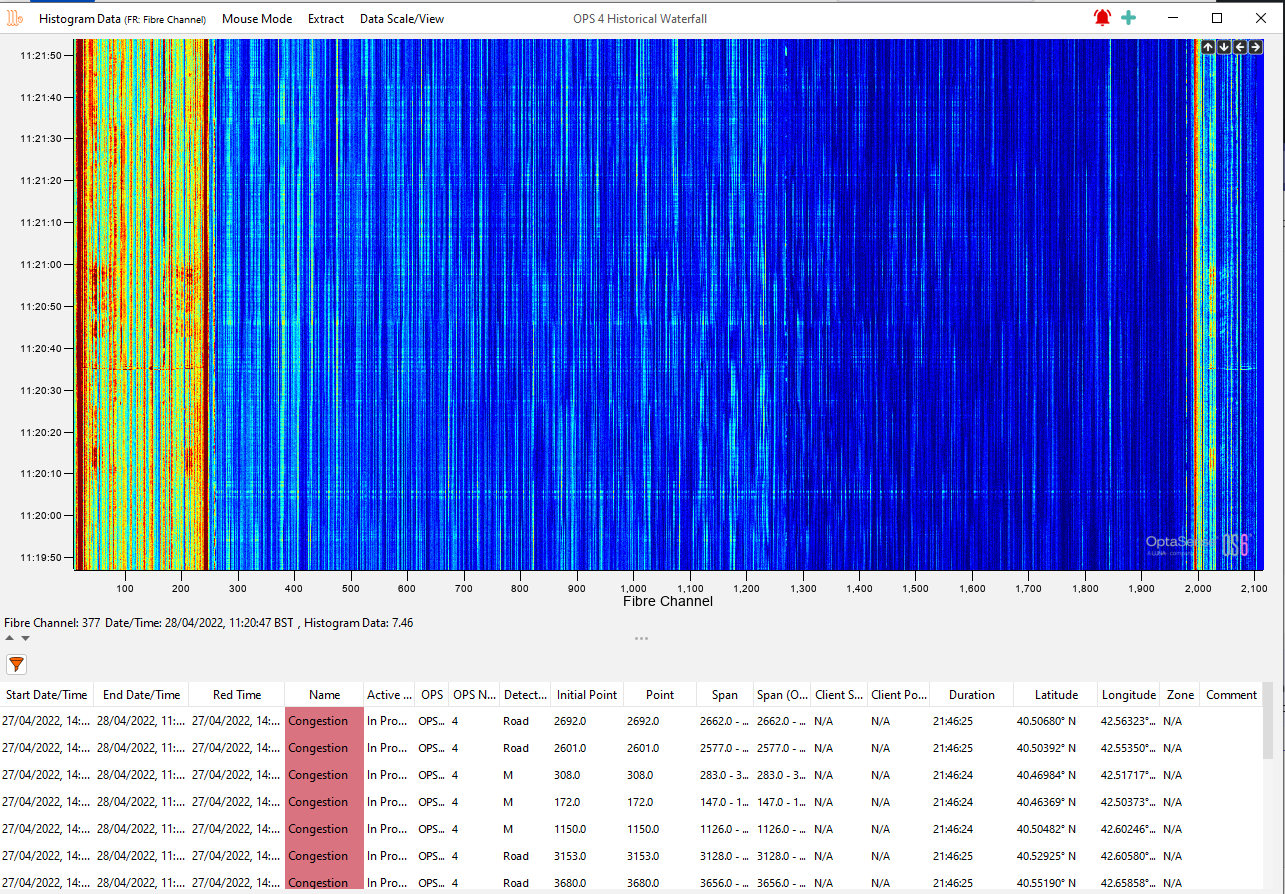
Figure 112: Historic Waterfall Data
Alerts available within the selected span will be displayed at the bottom of the waterfall. By clicking on an alert from the list an icon indicating the alert location will appear on the waterfall along with any track information associated with the alert. Multiple alerts can be selected at once.
Alert History Menu
The following tools are available in the Alert History Menu:
| Histogram Source | Allows the user to choose the source the data is displayed from – by default is the Histogram Rolling Recorder. |
| Mouse Mode | Channel Zoom – As with the full waterfall this allows the user to zoom in to sections of the waterfall Audio – Allows the user to draw a path over an event of interest and recall the audio Historical Analysis Channel – Allows the user to draw a path over a channel of interest and open an analysis window. Export Channel to WAV File – Allows to export file Measure Speed – enables the user to measure the speed of an event, in kph, mph or m/s |
| Extract | Raw Data – gives the user the ability to extract Histogram data/Sensor Data separately within the limits set out in the OS6 Architecture Specification CSV Data - gives the user the ability to extract Histogram data /Sensor data in CSV format within the limits set out in the OS6 Architecture Specification Waterfall Image – allows the user to extract the displayed waterfall image |
| Data Scale/View | Colour Scaling – Brings up the colour selection and data scaling control. Reset Zoom – Allows to reset zoom. Zoom Out – Zooms out one step. Adjust X and Y Axes – Allows the user to alter the time and channel range. Refresh Data – Refreshes the data on Screen. Scale Colour On Data Load – Scales the colours appropriately on load. |
Extracting Data
Clicking the Histogram Data option from the Extract menu option brings up the following dialogue box.
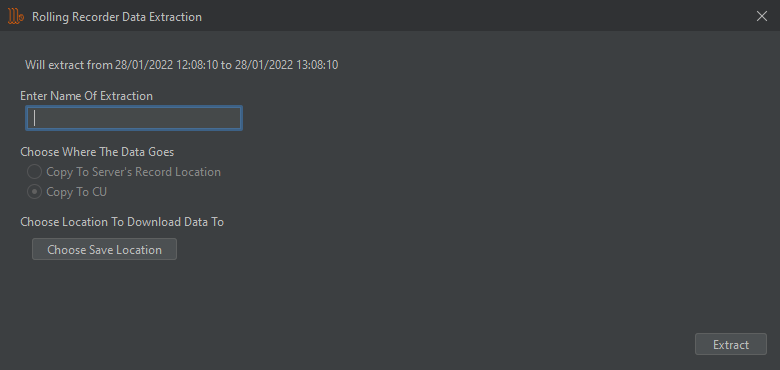
Figure 113: Rolling Recorder Data Extraction (Histogram Data).
The user should enter a filename relevant to the data being extracted. Sensor Data can be extracted to the server’s record location (typically disk4) or directly to the CU. Histogram Data can only be extracted directly to the CU (an appropriate location should be selected).
Alert History Examples
The following set of waterfall images illustrates the typical appearance of some alerts within the waterfall and histogram.
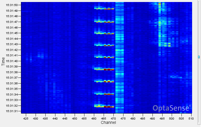
Manual Digging
| Manual digging comprises a series of short, sharp blows to the ground (Figure 114). In OptaSense, these transient signals display as narrow bands of energy in the Y axis (time) but possibly broad in the X axis (distance / channel spread). Digging methods vary, however the signal will likely repeat – usually every few seconds – with regular breaks, changes in frequency, and duration, but generally over a prolonged period we are looking for a series of individual impacts centred on a specific channel. A farmer may make impacts but will move around – the malignant digger will be centred on a specific location. With digging times to get down a metre somewhere between 20 minutes and a couple of hours the concerted effort of manual digging is very clearly distinguished from benign background activity. The detector can also incorporate positive or negative filters against cattle movement or very periodic activity (e.g., pumps, water dripping, etc.) which are known to create nuisance alert states. | 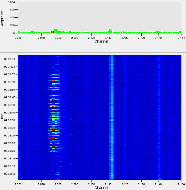 Figure 114: An example of Manual Digging on the Waterfall. Figure 114: An example of Manual Digging on the Waterfall. |
|---|
Personnel
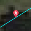
Like manual digging, walking appears acoustically as a series of transient impacts on the ground (Figure 115). The acoustic energy levels are generally much lower, typically only covering one or two channels and not as large an amplitude, however, they are usually more regular and can contain a velocity component – particularly if someone is walking along or beside the fibre.
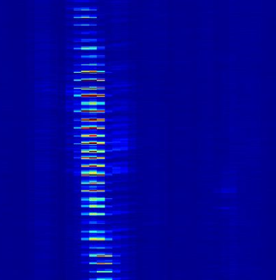 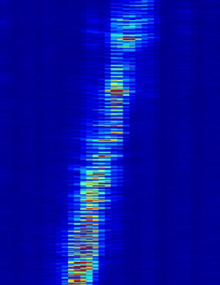 Figure 115: Examples of Walking and Running as they would appear on the Waterfall Display. Figure 115: Examples of Walking and Running as they would appear on the Waterfall Display. | The clearest way to differentiate walking from any other digging activity is to listen to a channel with walking taking place – it is very clear from the low frequency thumps that the sound generated is being caused by footsteps and not any other activity. Footsteps crossing the fibre will be static within a channel or two but will increase in intensity and then fade away in a very characteristic manner. Running footsteps will appear more intense and will be faster. |
|---|
Vehicle
| Opposite shows a vehicle travelling from left to right across the waterfall. This sort of signature is typical of a moving vehicle as there is a nearly constant signal (an unbroken line of increased noise) and is travelling at a sensible speed, in this case approximately 22kph. The intensity of the signal will vary with the size of the vehicle and its position relative to the fibre. This means that a large vehicle travelling offset from the fibre by some distance may look similar to a small vehicle travelling directly above the fibre. Similarly, the surface on which the vehicle is travelling will have an impact on the size of the signal, a vehicle moving quickly on rough ground will also create more signal than a slower moving vehicle. | 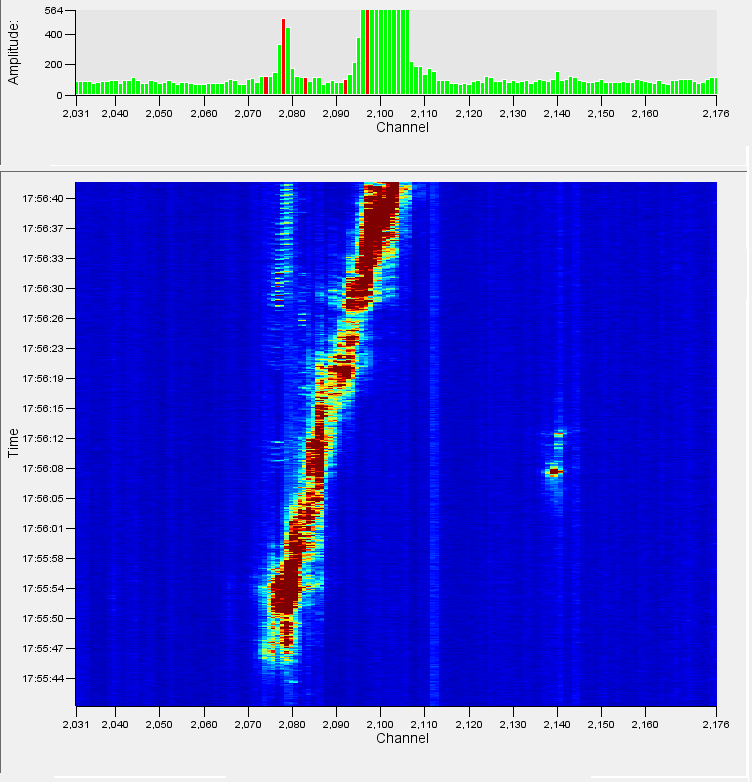 Figure 116: An example of a Vehicle traversing the fibre Figure 116: An example of a Vehicle traversing the fibre |
|---|
Mechanical Digging
| The acoustic signature generated by a mechanical digging event comprises a transient digging signal (similar to a manual digging event) and a localised engine tonal (Figure 117). The mechanical digging detection algorithm looks for these two components in tandem in order to determine which events are mechanical digging and which are other forms of ground works. There are significant differences between the acoustic signatures of specific types of excavators and this is taken into consideration when tuning the detection algorithms, i.e., what excavators are typically used locally? Large, tracked excavators and small gas driven pneumatic excavators are very different acoustically, so part of the installation process is to identify these excavators and tune accordingly. | 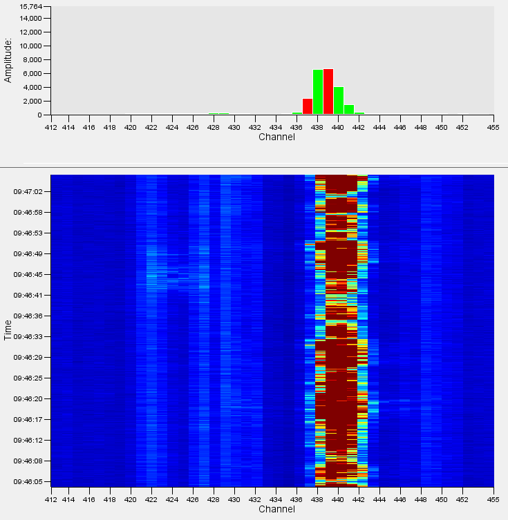 Figure 117: An example of a mechanical digging event on the Waterfall Display. Figure 117: An example of a mechanical digging event on the Waterfall Display. |
|---|
Activity Detector
The Activity detector is a versatile and powerful detection algorithm that can be tuned to alert on a variety of events. It is often used for detection of behaviours specific to an area, trenching machines or bulldozers for example. There are several different activity detectors, however the three most used are listed below.
General Activity - The General Activity detector is used as a “General Purpose” detector of abnormal activity. It looks for loud, prolonged acoustic events in the attempt to detect abnormal activity. For example, this detector could be triggered by bulldozers, trenching machines, Horizontal Directional Drilling (HDD) machines and piling.
Pipeline Activity - This algorithm is usually configured to detect any large-scale intrusions or events on a pipeline. Hot tap attempts often use tools such as drills and angle grinders to cut into the pipeline. These are localised, high energy acoustic signals that tend to last for short durations and are very different to surface based activities (digging, walking, etc).
Fence Activity - The Fence Activity algorithm is used for detection of threatening behaviour on perimeter or border fences. Typically, these activities include climbing, cutting, ladders and shaking (Figure 118). The Fence Activity detector is versatile enough to detect these activities but will require tuning for each activity defined by the client requirements or threat profile. Additional filtering is often applied to fence mounted systems to reduce the possibility of nuisance detections caused by weather.
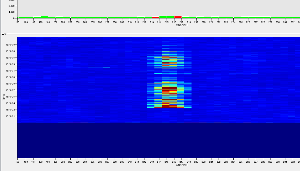
Figure 118: Fence climbing example.